Personal Project: Abstraction
This is my definition of abstract art:
Abstract photography is when the piece doesn't resemble something that you would see in real life or anything in particular or when you change something to make it look less like it is meant to be.
Some people say that all photos are abstract in some ways because they are just a 2D image and not real life. Some photos can be slightly abstract and others you won't even be able to tell what is going on in the photo.
The Formal Elements
Photographers are usually aware of the ways in which they can create interest in their images beyond the simple fact of the subject. This is what separates good pictures and bad pictures of the same thing. The following list describes some of the abstract elements in any photograph. Below the list is an example of how you can analyse a photograph looking for these things specifically and how this helps to give the image meaning:
Focus: Which areas appear clearest or sharpest in the photograph? Which do not?
Light: Which areas of the photograph are brightest? Are there any shadows? Does the photograph allow you to guess the time of day? Is the light natural or artificial? Harsh or soft? Reflected or direct?
Line: Are there objects in the photograph that act as lines? Are they straight, curvy, thin, thick? Do the lines create direction in the photograph? Do they outline? Do the lines show movement or energy?
Repetition: Are there any objects, shapes or lines which repeat and create a pattern?
Shape: Do you see geometric (straight edged) or organic (curvy) shapes? Which are they?
Space: Is there depth to the photograph or does it seem shallow? What creates this appearance? Are there important negative (empty) spaces in addition to positive (solid) spaces? Is there depth created by spatial illusions i.e. perspective?
Texture: f you could touch the surface of the photograph how would it feel? How do the objects in the picture look like they would feel?
Tone: Is there a range of tones from dark to light? Where is the darkest value? Where is the lightest?
Abstract Photograms
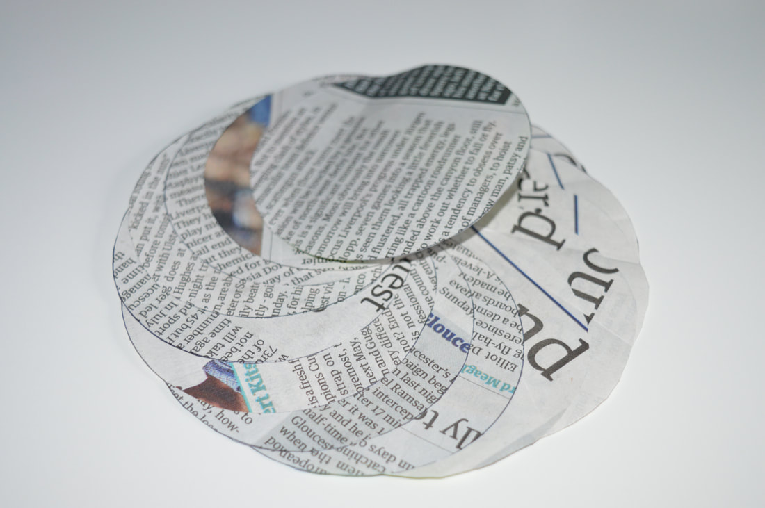
A photogram is a camera less photo made in a dark room by covering photographic paper in any way you want and exposing it to light.


First of all I made some photograms just using a spiral of paper one with spikes and one just curved but after I had made some I thought there was too much empty space so I did it again with other objects and paper with text on it. One of them came out really weird but I like it because the paper went all blurry.


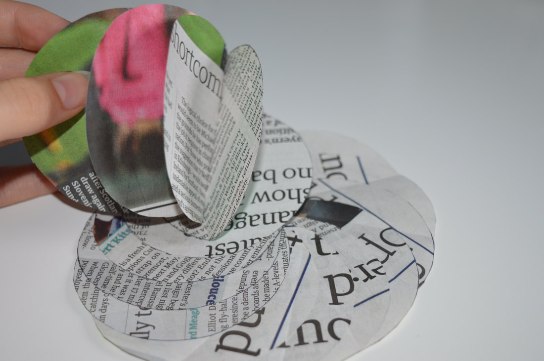
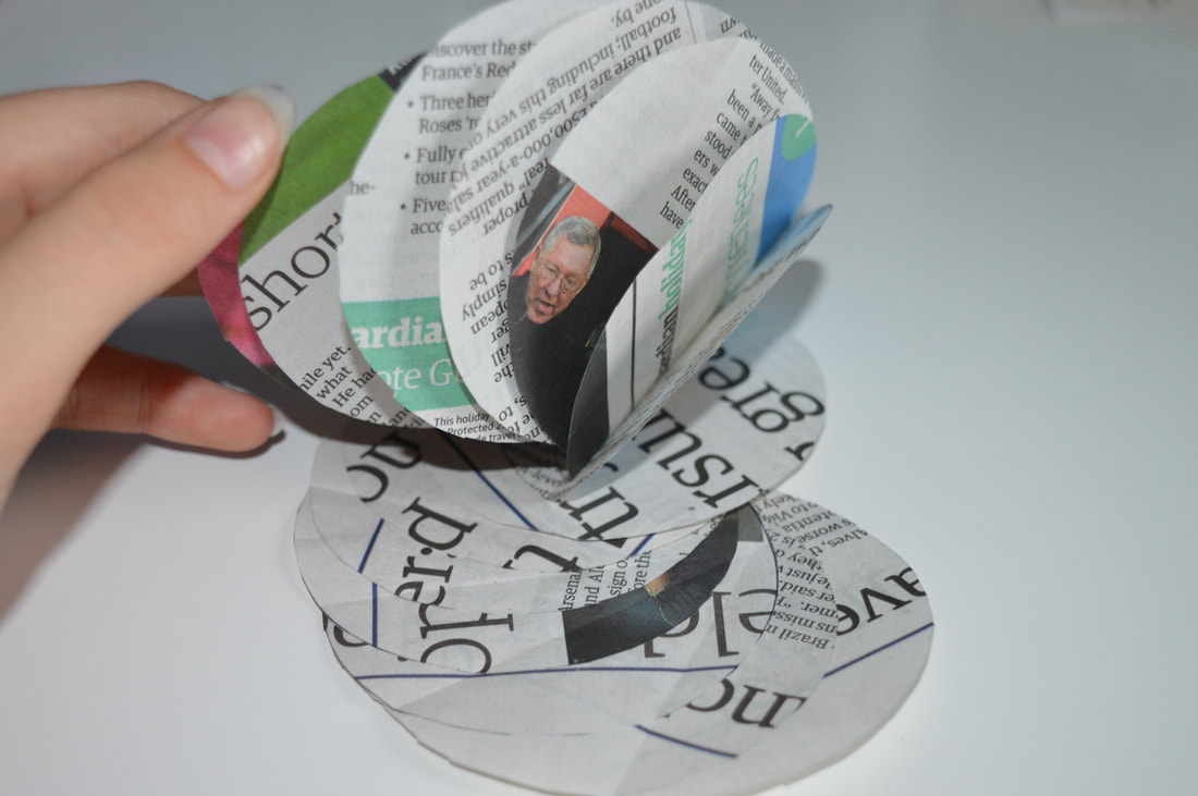
I cut one of them up and took it back into the dark room and put all the pieces under the enlarger with them overlapping. I really like theses ones because there are so many different tones and shapes. But if I was to do it again I would layer them closer together so there wasn't as much empty space.
Duotone and Blending


Using Photoshop I started off by making some duotones using the photograms from class. I did many colours with some different photograms including the original and the cut up ones. My favourite one that I made is the blue one because I think that the light and dark blue make a really nice contrast and show well against the black. I then blended a photogram with one of the abstract photos I took over half term. Because I had just done duotones I wanted to see what the two photos together would look like if that was a duotone. I think they are really interesting and even more abstract.
These are some other options that I could have gone with for blending there photos together:


How to create a Duotone
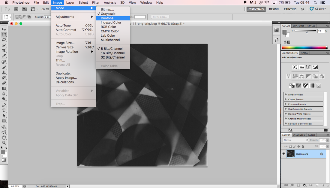
Make sure that you start with a greyscale photo and then change the image to a duotone.
|
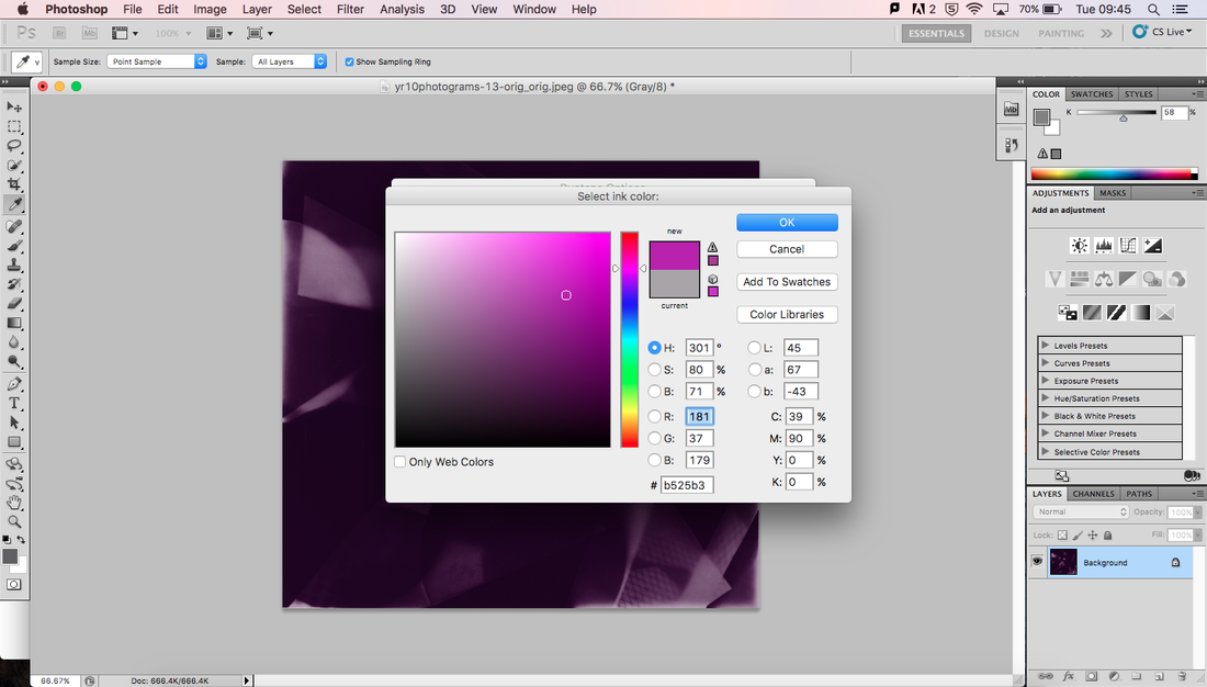
A box will come up and you have 2 colour options. Leave 1 as black and with the other select the colour you want.
|
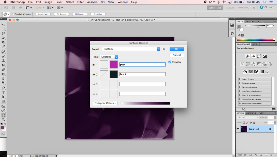
Then you will have to name the colour you selected. You can choses a different colour to black but the colours might mix together in a strange way.
|
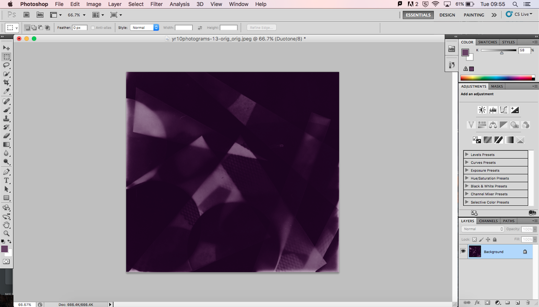
Press OK and you have your duotone image.
|
|
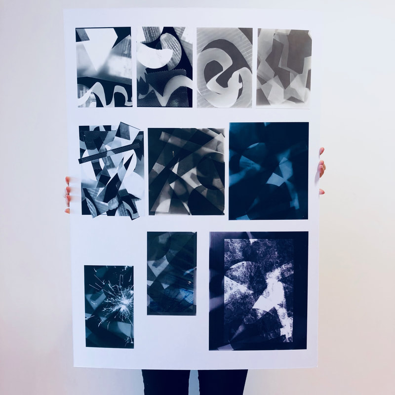
To bring the topic of photograms to a close I mounted all three different types of photos I made onto one big board. I am pleased with the way it turned out overall and I like that I have included both big and small photos. On my board I included all types of different photos that I made showcasing the full extent of my experiments. My favourite is one of the small duotones blended with a photo of a sparkler. I think it turned out really good because the sparkler doesn't cover the whole photo so the duotone is still very visible but also makes the photo a lot more interesting by having a burst of something completely different to the photogram. The two photograms in the top right corner that I made with a spiral of paper didn't really turn out as well as I wanted them to. I would prefer if there was a bigger contest between the light and dark parts of the photogram. If I was to make them again I would use something a bit thicker than the paper I used because if I had let it develop longer so it was darker the lighter parts would have not been very clear. If I wanted to change the contrast now I could do it in photoshop.
|
Keld Helmer Petersen
Keld Helmer Petersen was a Danish photographer who was mostly an architectural photographer but also seemed very interested in abstract photography. He was born in 1920 and died in 2013. He is mostly famous for his coloured photos but he has also published a few books of black and white photos which is what I'm interested in. His book Black Noise is what I am inspired by. He made a series of highly contrasted photos inspired by Albert Renger-Patzsch.


Above are my favourite photos from his abstract book. I really like the big contracts and the structural shapes. You can tell that he is still interested in architectural photography as his abstract photos are still inspired by his earlier photographs.
I would like to crate some photos like his, with high contrast between black and white shapes and lines. I'm not so interested by the architectural aspect of his photos, I think I am more inspired by the shapes and making them less noticeable as things you see in real life. They remind me slightly of photograms due to the contrast and the way that there is no colour and limited tones.

|
This is my favourite, I like the way that you have to look really hard to fully understand the photo. He makes it seem like a reflection like on water on a mirror, but in fact it is just the same photo flipped and put next to it. It's kind of an optical illusion. Its a really busy photo with a lot of lines going all over the place, but it also has a lot of empty space that calms down the photo. I would say that the main focus of the photo is the line in the middle where the two photos meet. It is the densest part of the photo with the most lines overlapped and making bolder black lines that draws your attention to the middle. At first you might just think that it is paint or just random lines and splodges. I really like the way that you can't immediately tel that it is a photo of a plant that has been edited to have a really high contrast.
|
The photos that Petersen makes might be nice to use in combination with my research that I have done below. Mads Perch made one of his photos using something quite similar, he used a black and white line photo that looks really interesting projected onto someone. It makes me think of an optical illusion which is very abstract.
|
|
For these photos I played around with focus and having either the whole photo out of focus or have the foreground or background blurry. I really like how most of these turned out but they aren't very abstract because you can tell what it is in all the photos. If I was to play around with focus again I think I would also add in playing around with another formal element of abstract photography above.
|


These are some photos that I took over half term:


www: I have a range of different photos that look at different aspects of abstract photography. Geometric and structured photographs, sunsets edited to look less realistic, close ups of the sea and the interesting patterns it makes and distortion of the photography without editing it at all.
ebi: Take more photos of the sunset in different places and change the colour so they aren't all so similar.
ebi: Take more photos of the sunset in different places and change the colour so they aren't all so similar.

|
This is my favourite one because it reminds me of a cartoon. It kind of has a fake/animated look to it and I think the glowing colourful lights add to that because on real life buildings you don't expect to see vibrant colours. All the shapes are really geometric and the lights and flares are all in straight lines adding to it's blocky look.
|
My Photo Book
I looked on google images to give me some inspiration for my own photo book and these are some of my favourite photo books I found:
|
|
Ideas for my photo book:
-a book that is either in a box or attached to a box -something really small or really big -a simple concertina book with cut outs -an actual book with writing in it that I put photos in -a book that folds up really small -a different shape folding book such as a circle |


This is a prototype for my photo book.
I decided to go with a circle folding book and I really like the way it turned out but I want to make some sort of cover for it.
I decided to go with a circle folding book and I really like the way it turned out but I want to make some sort of cover for it.
|
|
|
These are some of the photos I have chosen to go into my book:


Mads Perch
Mads Perch is a photographer that makes loads of different types of abstract photos from light patterns to ink over the top of photos. What I like most about his work is his projection photo shoots.
Projection


He created a series of photos exploring projection of colour and pattern onto his models making their skin completely different from normal. The girl is the main focus of the image with absolutely nothing happening in the background. Some of her body seems to be disappearing into the black background. Even the projections on her skin are abstract by the lines bending and changing their original shape around the curves on her face and shoulders. I think that she is made to look like she comes from a dream where everything is weird and different. All the different types of projections that he has used make the girl look completely different. For example he the first one seems like she is in space or even 'from another world' or maybe like she is part of the galaxy. Projection photography was first used by John French and he used the projections to replace the clothes on a model. He used floral patterns and always put them in black and white.
To respond to Perch's work I first had a photoshoot with my sister as a base to work on in photoshop. My stairs where a perfect place to take these photos, the walls are plain white and the stair allowed me to easily try out different angles. I took around 50 photos but refined the down to my favourite 6. I would have liked to have a more variety of photos from different angles, but they didn't work as well. You can see from the photos that I picked there was one angle that worked very well, and one that I picked you can see down my stairs into a room slightly but I liked the photo so I just thought that I could crop it out.


|
|
In Photoshop I didn't go straight to making a photo like Perch's, I was inspired by his work and wanted to layer two or more of these photos together. I chose a base photo and then I added the one of her looking sort of to the front bigger on top and a smaller one that was more similar to the base on the right. I made the first one but I didn't think that the proportions were right. The sizes of the three photos were too similar so I made another one making the photo on the left a lot bigger. Then I wondered if it would look better if the opacity of the layered photos were less so that the base photo was more dominant. I made a third changing the opacity but I didn't think it was as good as the second one as while changing the opacity I also by accident changed the size of the photo on the left.
|


I experimented with Photoshop, layering pictures on top of images of people. I tried this instead of projecting an image on top of a person but if I had more time I would have preferred to have tried both. I think that projection would have come out with a result that was more like what I had intended to do.
|
|
These are my 3D experiments. I like the way that they look, it gives the original photos more definition and is more interesting to look at rather than it all being one level. I played around with which ones should be higher than others and taking photos of them from different angles. I made them just by balancing the photos on top of small blocks and if I had more time I would have liked to continue with making them more presentable by making the ones that are on top some sort of box so they are more sustainable and so they look more presentable. |


My final piece is 3D. I wanted to make it so that if you look at the photos from different angles then they look different. Before making the final piece I was experimenting with making the photos 3D. To make the original image I used a photo from a previous photo shoot I did with my sister and I used an image of space that I found and blended them together in Photoshop. I blended the photos together and lighted the image to make her face more visible because I wanted her face to be the main focus and not be downed out by the colours and the stars.
