|

|
|
Initial Thoughts
I chose the choice of colour to find out the answers to these questions that I have:
Why were photographers sceptical about changing from black and white to colour photography?
How does colour effect the mood of photos?
If you change the colour of a photo, does it change the overall meaning/ purpose of the photo?
Why were photographers sceptical about changing from black and white to colour photography?
How does colour effect the mood of photos?
If you change the colour of a photo, does it change the overall meaning/ purpose of the photo?
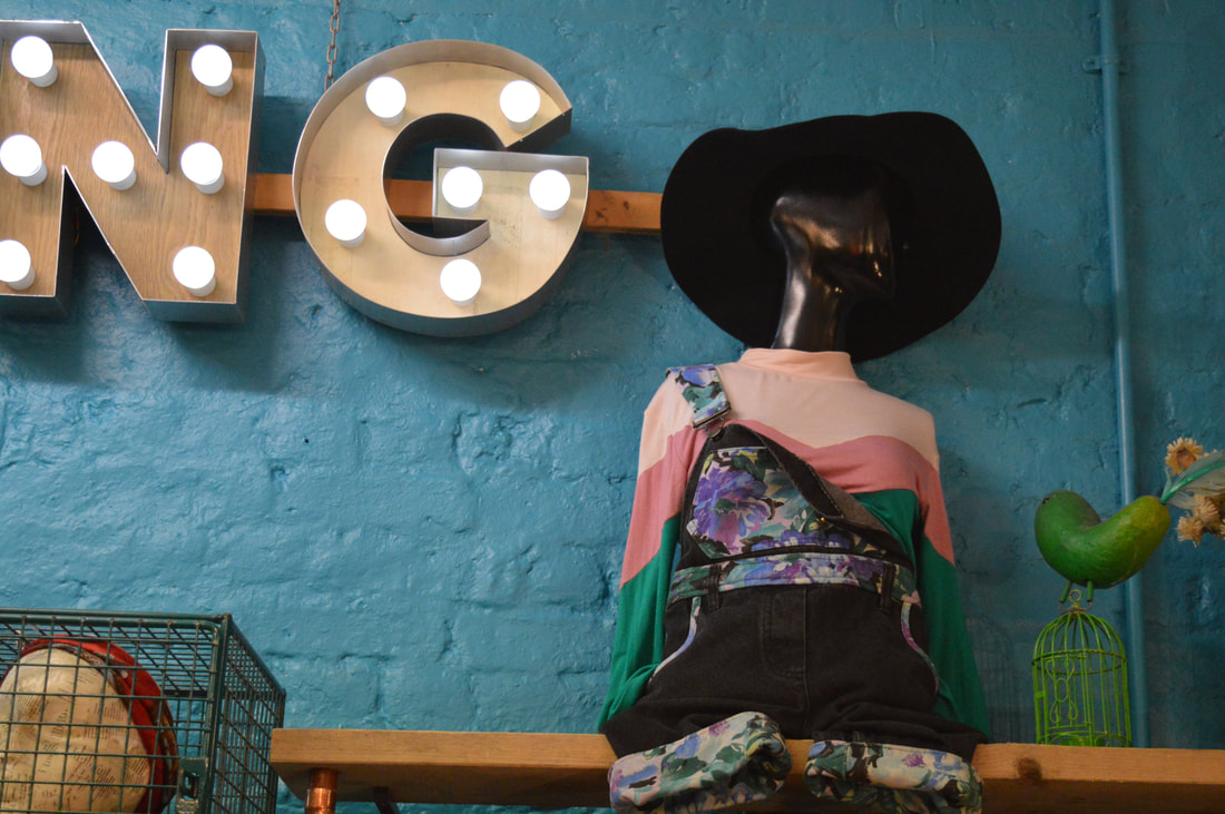
The choice of colour can be linked to multiple threshold concepts. The two that I think are the most relevant to this topic are concept 7 and 4. Concept 7 can be linked with the choice of colour because it explores how the means of photographs are never fixed and they can be changed by many different factors, one of them being colour. In my opinion when you take away the colour from a photo you make it more emotional and I link black and white photos to moving and sad photos. In contrast adding colour can bring the photo alive and connect the view to the photo more. It also adds brightness and I think that colour can be associated more with hoppy and positive images. Colour photography is often used in advertising and this is because colours catch people's attention and entice them into looking at the advert.
Concept 4 explores how photography is an art of selection rather than invention like other visual arts. Most visual arts take inspiration from things that already exist, however photography has to rely on the world and what it has in it. Photography isn't just about reflecting what is already out there, overtime you take a photo you are creating a new perspective. When taking a photo you have to think carefully about what you are putting in the frame and I think this links to the choice of colour because you have to pay attention to the colours that you are including to make sure that you are creating a photo that follows your desired purpose for it.
Concept 4 explores how photography is an art of selection rather than invention like other visual arts. Most visual arts take inspiration from things that already exist, however photography has to rely on the world and what it has in it. Photography isn't just about reflecting what is already out there, overtime you take a photo you are creating a new perspective. When taking a photo you have to think carefully about what you are putting in the frame and I think this links to the choice of colour because you have to pay attention to the colours that you are including to make sure that you are creating a photo that follows your desired purpose for it.
Colour Theory
|
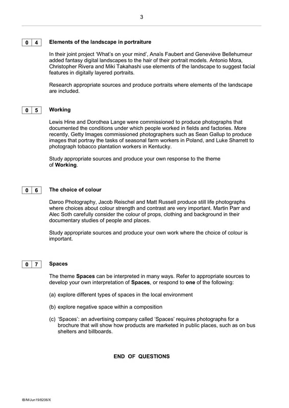
Colour theory is a definition of colours based on a colour wheel. It is also the basic guidance of combining colours and the visual effects of colours. The wheel starts with the primary colours which can't be made by any other colours but are what you make all other colours with. Then there are the secondary colours which are made by mixing two of the primary colours together. And lastly there are the tertiary colours which are made by mixing a primary and secondary colour together. Colours from opposites sides of the wheel are what are called complementary colours which means they go together well because of the high contrast between the two colours. In art with paint when you mix all the primary colours you end up with brown however, in photography when you mix all three primary colours you end up with white (the absence of colour).
|
|
Why Colour or Black and White
Photographers may decide to create black and white photographs when the light, form and texture is more compelling without colour. On the other hand, some photographers will choose colour to create mood, emotion and sometimes colour can be important to the story behind the image. Also, colour photography is used a lot for advertising using bright and bold colours to attract attention. Some people view black and white photography as something of the past and that people only shot in black and white because of technical limitations but others view it as a creative choice. After the invention of colour photography people still explored black and white because it was seen as the purest form of photography. When you remove the colour from a photo you take away any distraction form the subject.
Mitchell Kanashkevich: Captivating Colour
"Colour is as much a part of visual communication as composition and light. If you are not fully aware of this fact while framing/composing color images and later when post processing them, you’re quite simply not in full control of what your photographs communicate. A knowledgeable, intentional approach however, turns color into a powerful ally that helps us convey stories, emotions, sensations and moods from within the photographic frame."
This is a quote from Mitchell Kanashkevich when he is talking about a book that he wrote discussing why colour is important in photography. He sees colour as an element of photography that is overlooked and disregarded. He explains how he thinks that it's very important to think about the colour in the image you are creating before you actually go ahead and take the photo instead of just accepting what ever you get when you print it. He describes how the colour impacts greatly the overall mood the picture has.
This is a quote from Mitchell Kanashkevich when he is talking about a book that he wrote discussing why colour is important in photography. He sees colour as an element of photography that is overlooked and disregarded. He explains how he thinks that it's very important to think about the colour in the image you are creating before you actually go ahead and take the photo instead of just accepting what ever you get when you print it. He describes how the colour impacts greatly the overall mood the picture has.
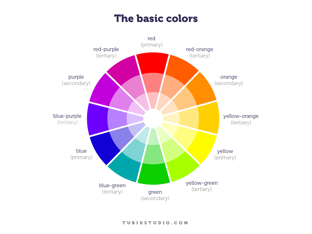
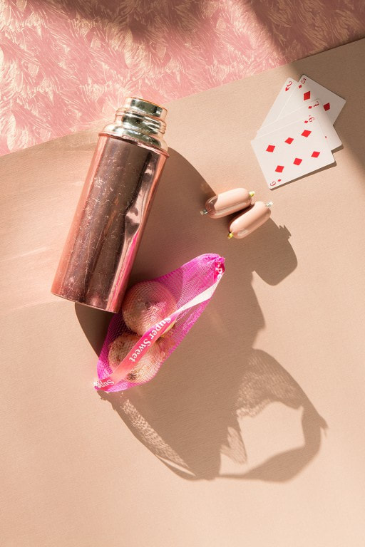
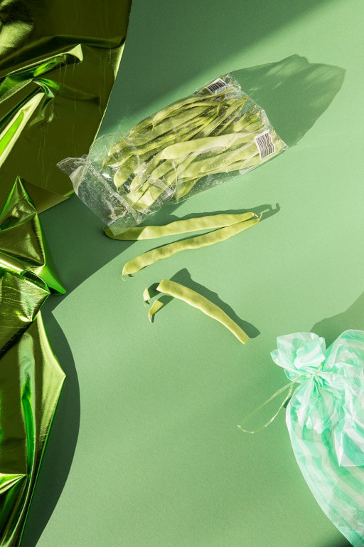
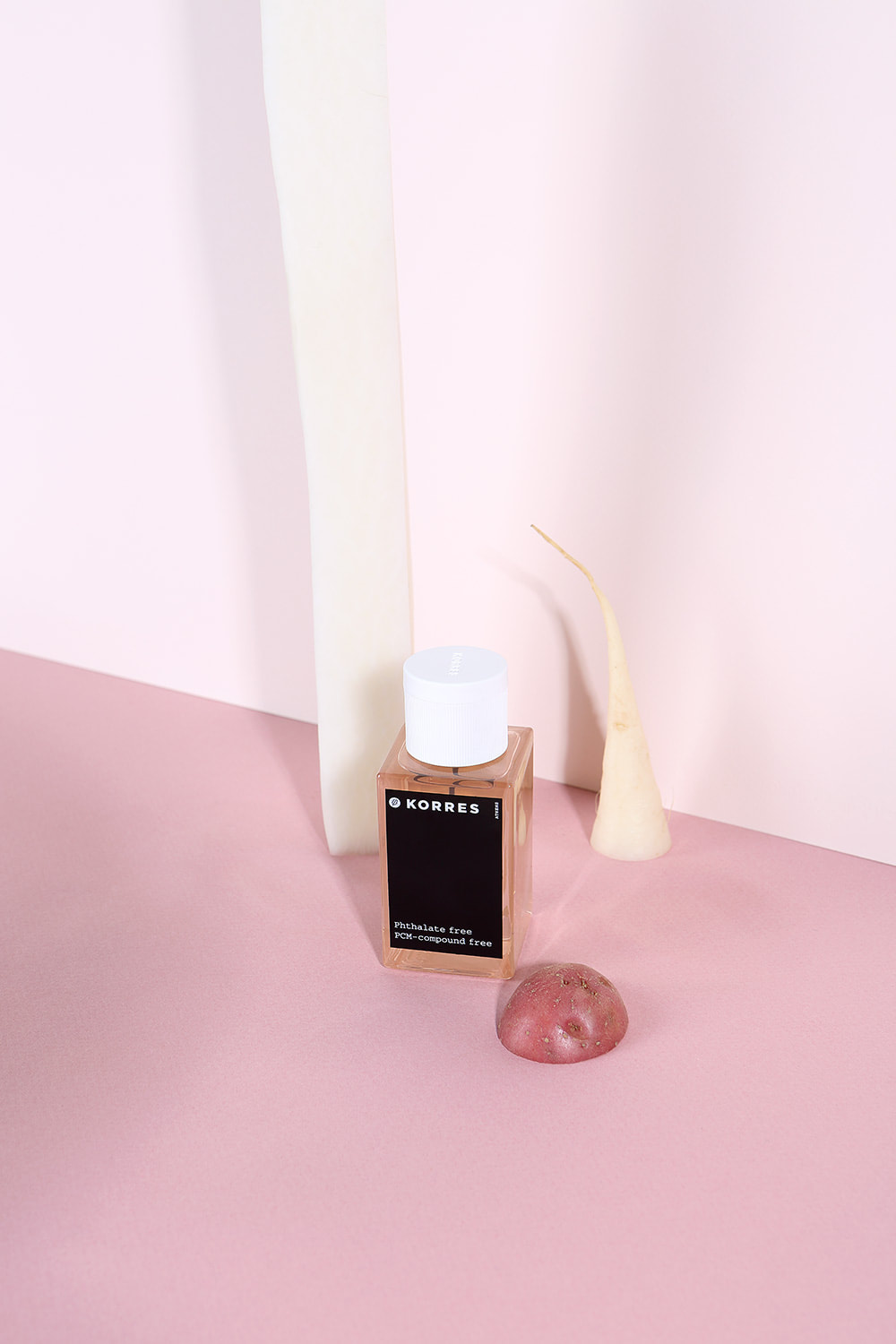
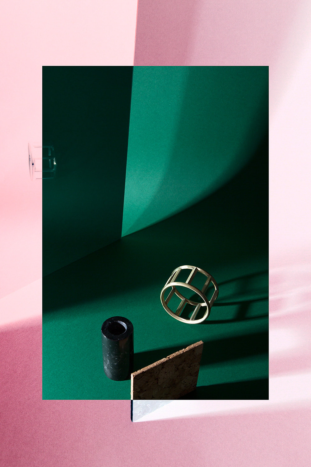
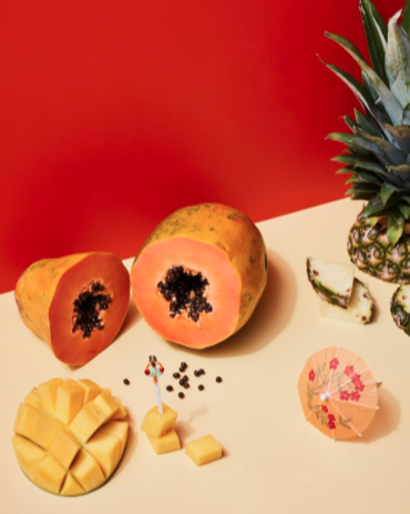
Jacob | Reischel
Marie Jacob and Julia Strathmann are the two women who make up the duo Jacob Reischel. They are based in Berlin and make still life photographs both contributing different talents. Marie Jacob is a photographer and Julia Strathmann is a graphic designer. Their different skill sets when put together produce very interesting still life photographs.
|
|
|
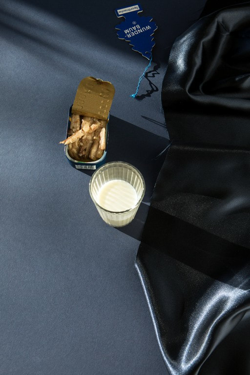

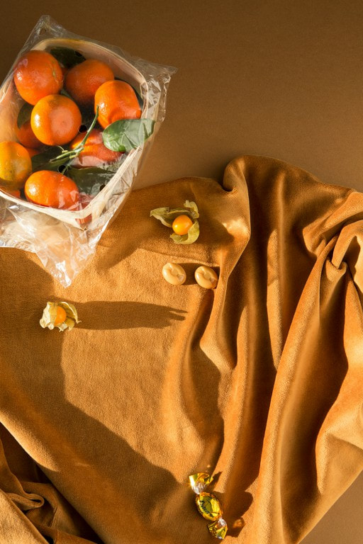


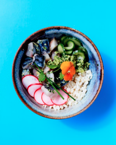
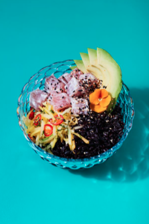
Matt Russell
|
|
Matt Russell is a commercial photographer and his use of vibrant and deep colours makes his photos eye catching and makes the food look appealing. Personally, I have no interest in taking photos of food, however the way he does it makes it seem fun and interesting. I think that his use of colour is clever and I like the way that he chooses his background specifically for each photo in order to make the colours in the food stand out more. Colour in advertising is very important because when you create a photo with bright colours the viewers associate happy emotions with the thing they are looking at and if dull and boring colours are used people won't be motivated to use or buy the product being advertised. He uses a lot of blues which has a calm effect and makes the product being advertised seem trustworthy. Also, a colour that heavily features in his commercial photos is red which is bold and associated with power.
|


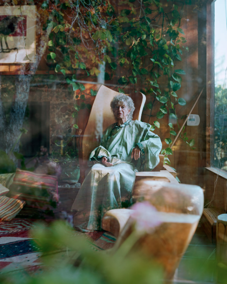
Alec Soth
|
|
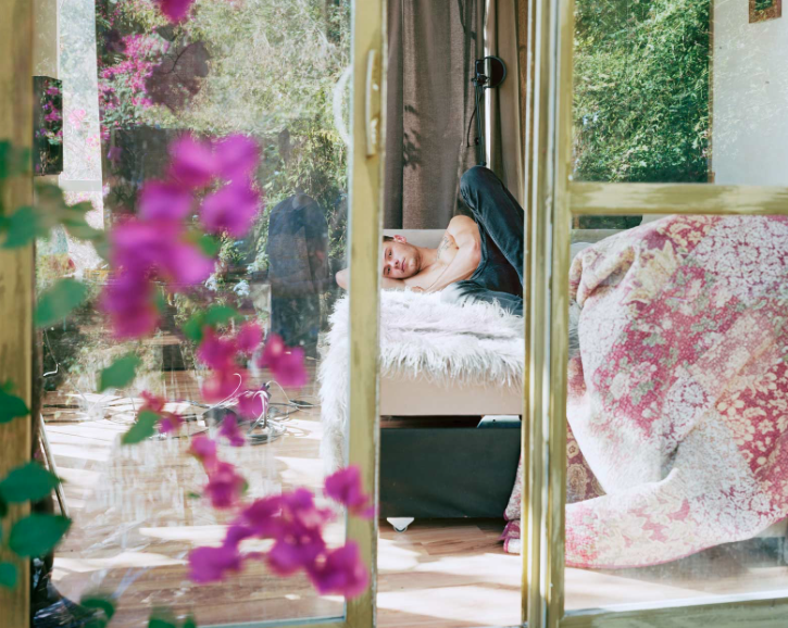
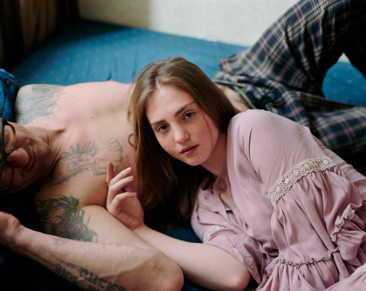
The photos that I have selected as my favourite from Alec Soth are from his most recent work called 'I Know How Furiously Your Heart I Beating'. In this he explores people and what makes them .He is interested in the relationship between the belongings of the person and how the objects around help the viewer understand about the person. The photos are taken from inside and sometimes through a window or glass. This creates a sense that he, as the photographer, is just a narrator telling someone's story. All the photos are filled with colour, but I think the colours that he uses create a slightly different mood to other photographers that I have researched. The colours are light and I think this gives the photos an uplifting and happy feel to them. The way he uses colour makes the photos seem peaceful and calming. Compared to the still life photographs of other artists named on the brief, I think that the way he takes photos of real life help understand the person better and lets the viewer find a connection between themselves and the subject of the image.
|

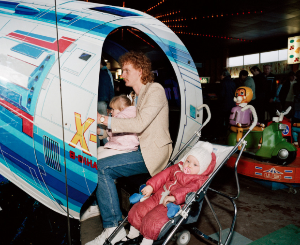
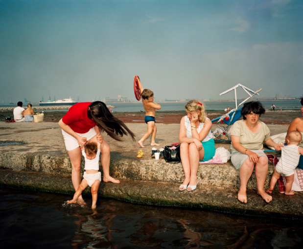
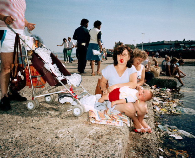
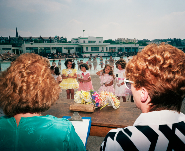
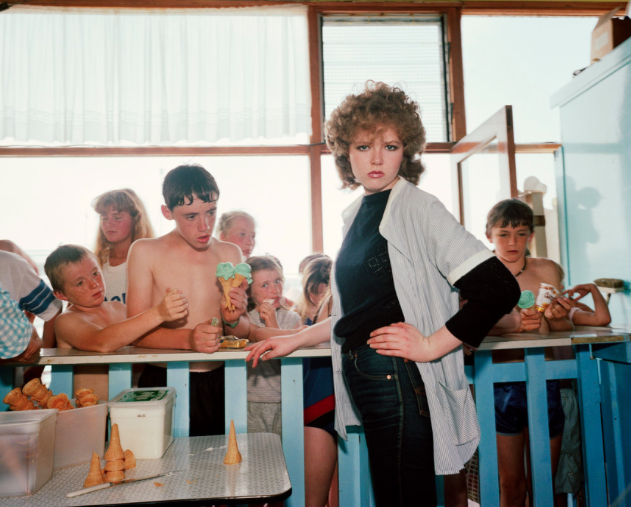
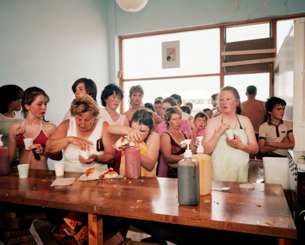
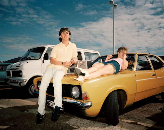
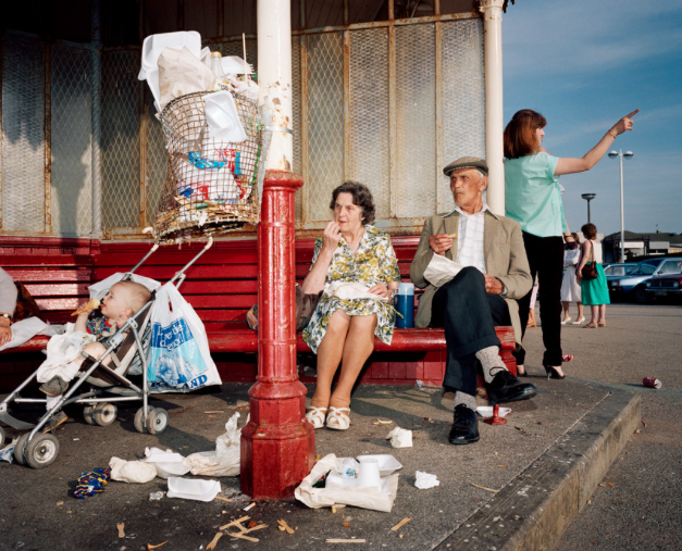
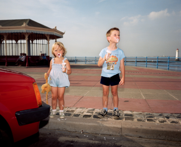
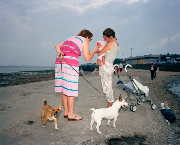
Martin Parr
|
|
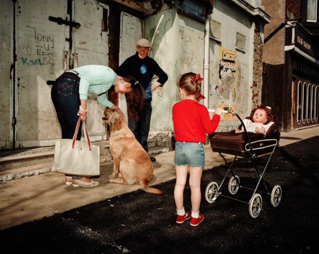
In Martin Parr's photographs he explores aspects of modern human life. He takes photos of things that are strange and out of the ordinary and uses colour to bring focus to these things and make them stand out. My favourite part of Martin Parr's photographs is the way that the photos are really dark. This is created by using the flash on a camera and I think that it makes the photos really eye-catching and vibrant. Because of the background, the colours in the foreground are more noticeable and it creates a bigger contast between the colours. If the photos were exactly as we see in real life and not as dark then I think the photos could look meaningless and as if the were taken by people on holiday. His photos act as a window into what we do when on holiday or by the beach whether that is something normal or out of the ordinary. We can relate to his photos and the colours make the people seem more alive.
|
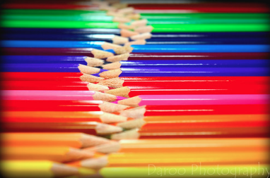
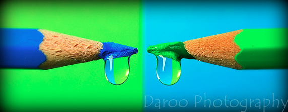
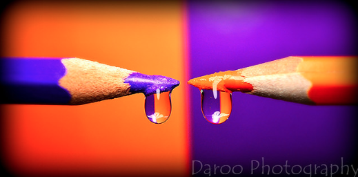
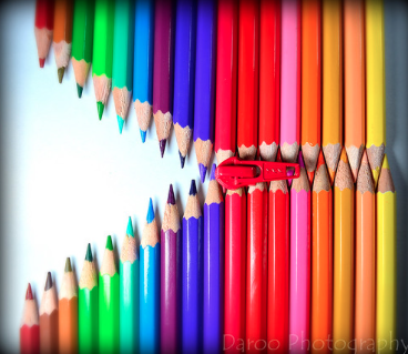
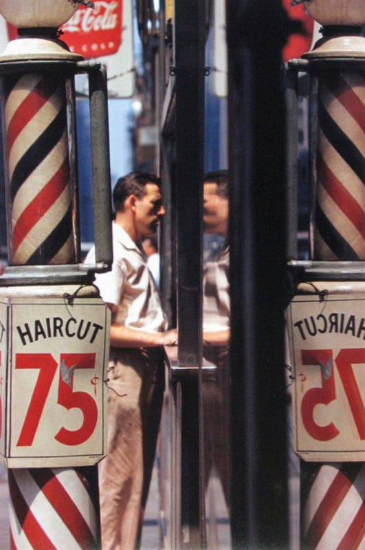
Daroo Ulises
|
|
Personally, I don't like Daroo's photos. I struggle to understand the meaning behind them and for me that is a very important part of an image. I enjoy photos that puzzle you and when you have to think in depth about the choices a photographer has made and why the chose to create the photograph. I think that you could say that his use of colour is interesting because he has edited the photos to create a more noticeable contrast between the green blue and orange tones. This sort of photography is used in advertising to entice people in. There are other photos that he made that could be linked with the choice of colour that are very different to the first six I have. He has photos of coloured pencils making different patterns and creating reflections with water. I think these are slightly more interesting as they have more elements to them, but even these I think are slightly plan and I wouldn't personally take photos like them. The main thing I will take from these photographs is using contrast to create bolder and more noticeable colours.
|


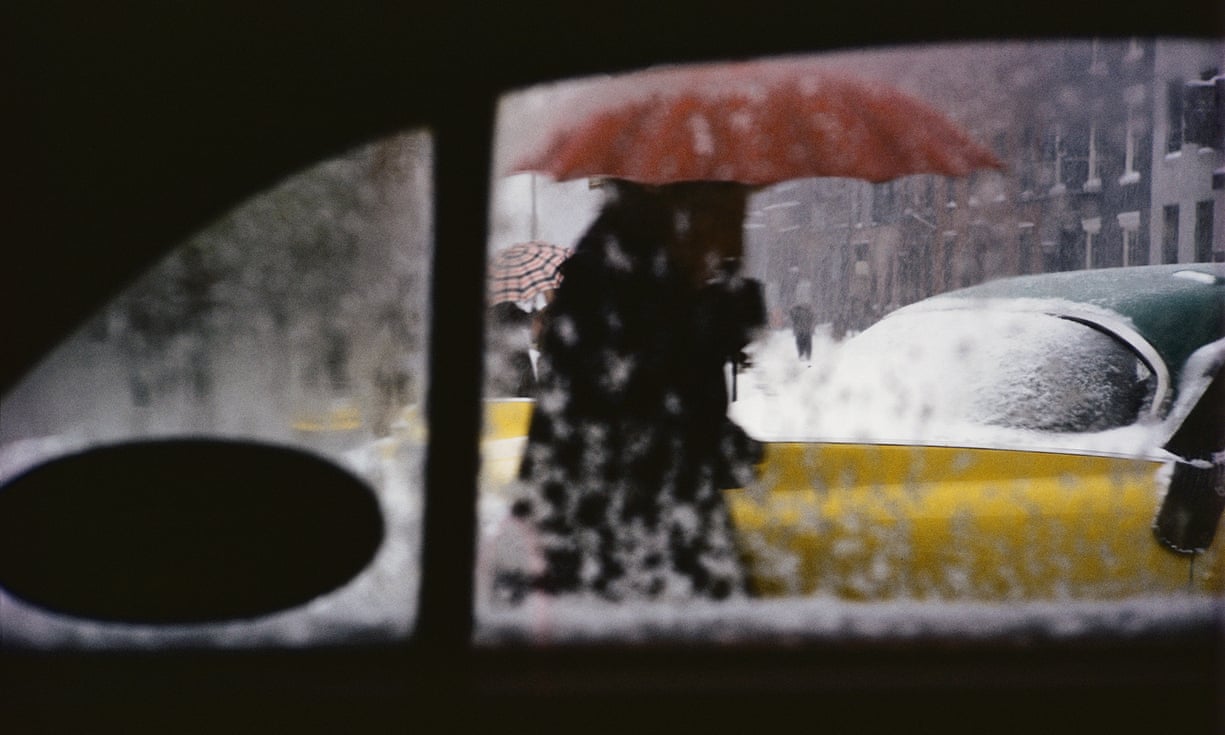
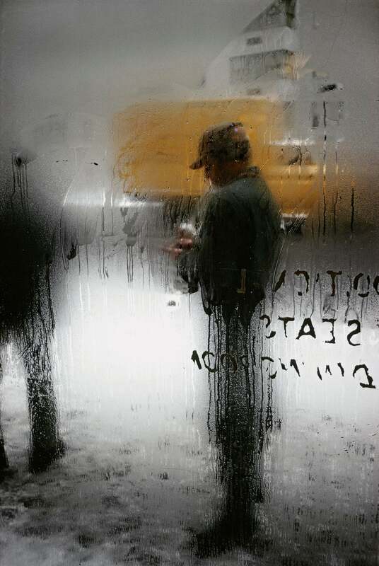
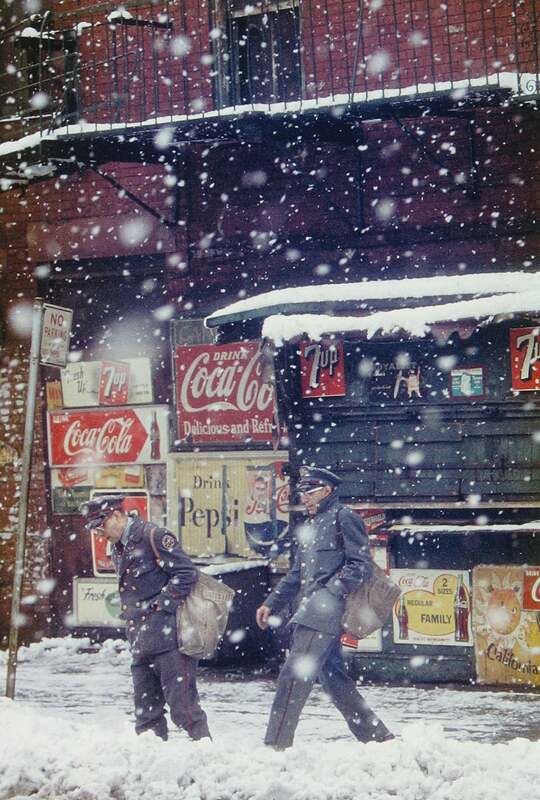
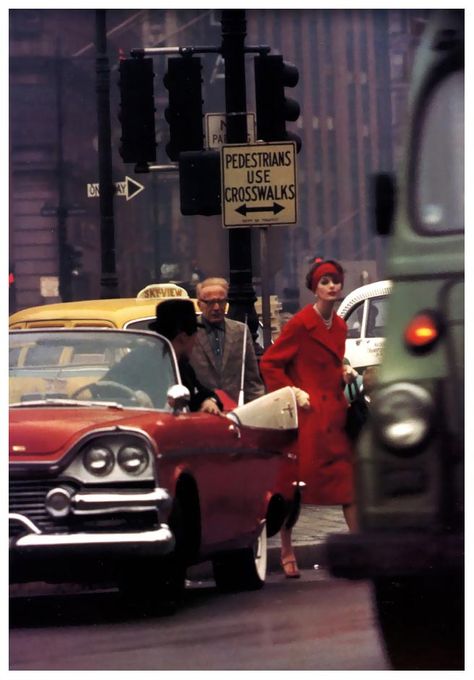
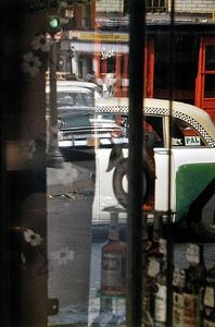
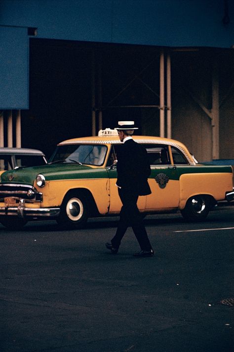
Saul Leiter
|
|
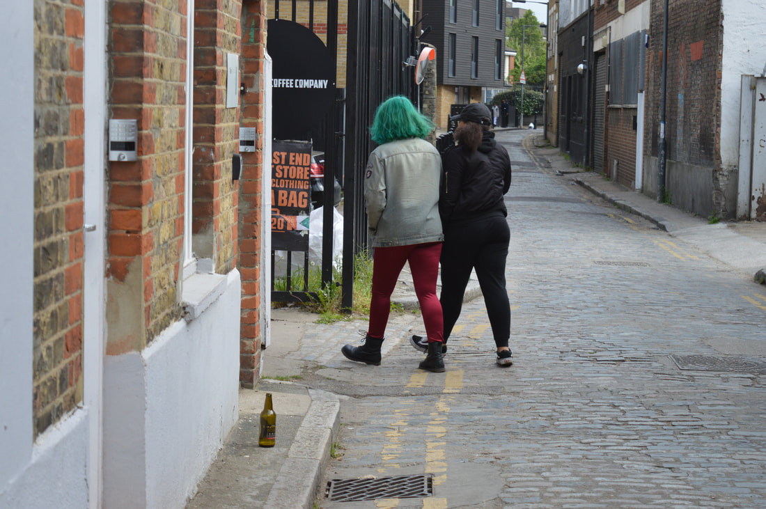
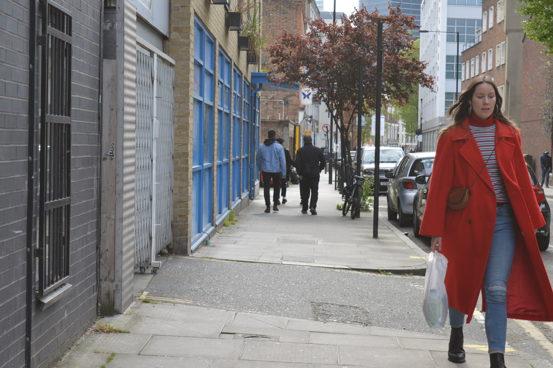
Saul Leiter was a street photographer known for his interesting use of colour. In his photos he tries to make one colour stand out more than the rest. Usually, there is a person in the photo that is the main subject but the attention is taken off the person by the photo being obstructed by something or part of it is unclear or blurry so that you focus more on the colours in the photo. My favourite photo is the one of a lady in the road in a bright red coat. He mainly used Kodachrome slide film which has has saturated colours, in particular warm tones.
|
Stefanie Moshammer: Land of Black Milk
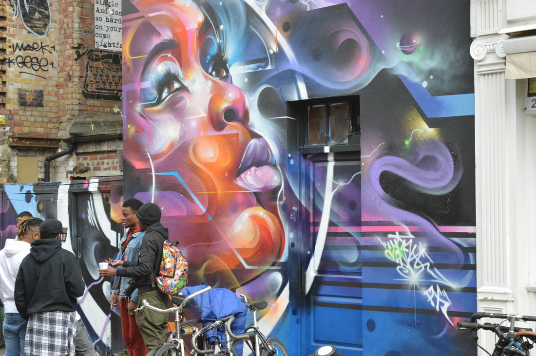
Stefanie Moshammer went to Rio de Janeiro to experience and take photos of the culture of the city and along with that came an amazing array of vibrant colours. I love street photography and this work by Moshammer really interestes me because I love the way that she captures the colour and life of the city. I think that the colour brings the photo alive as well as allowing us to have a sense of what it feels like.

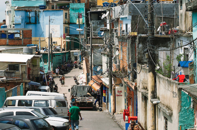
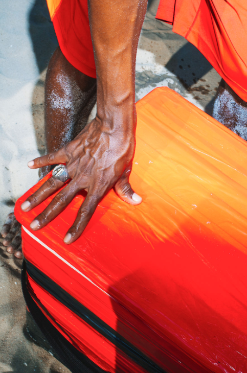
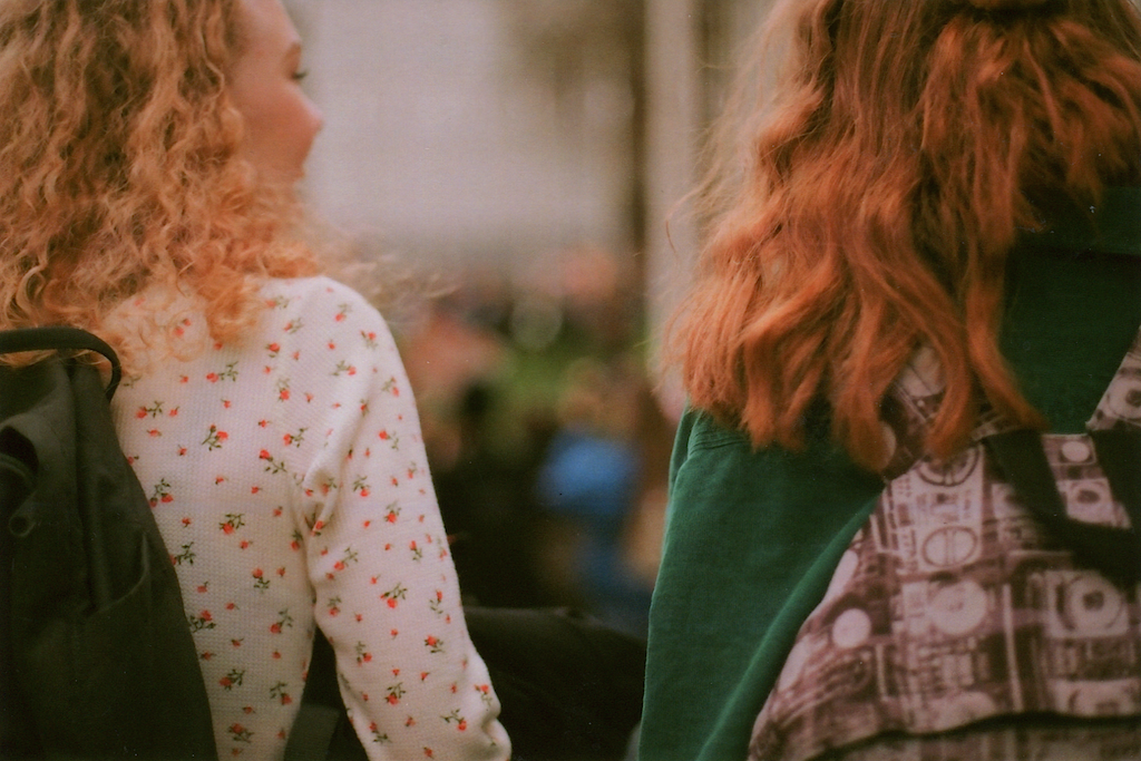
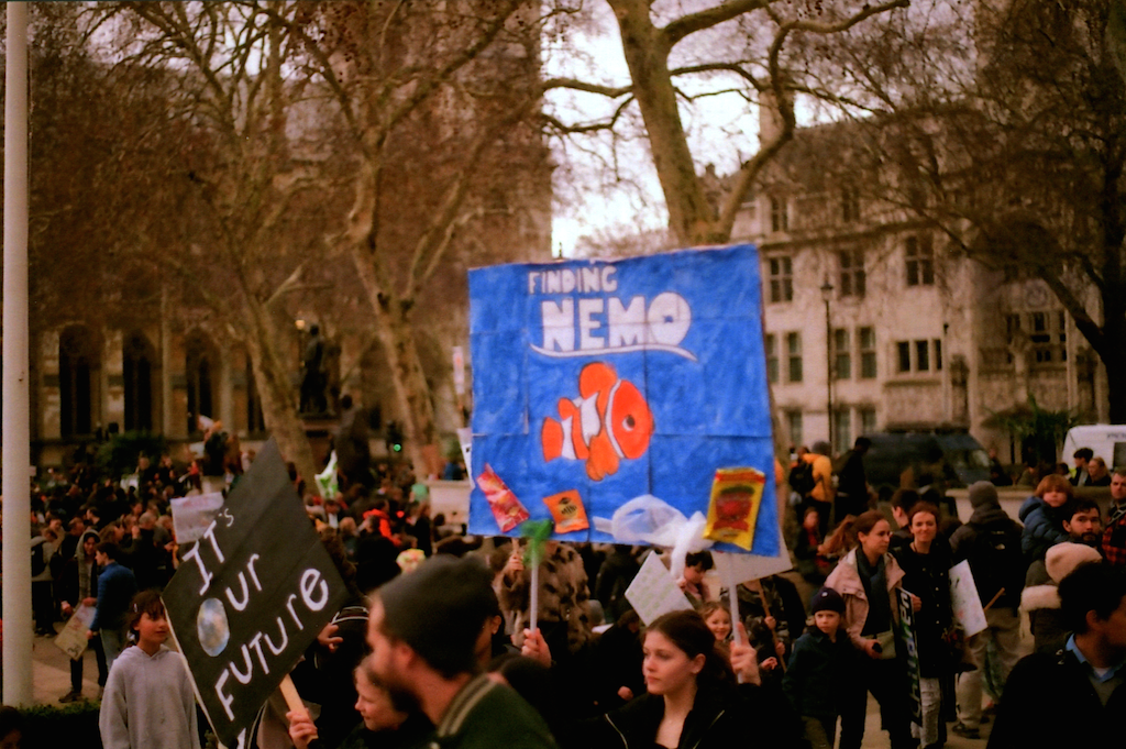
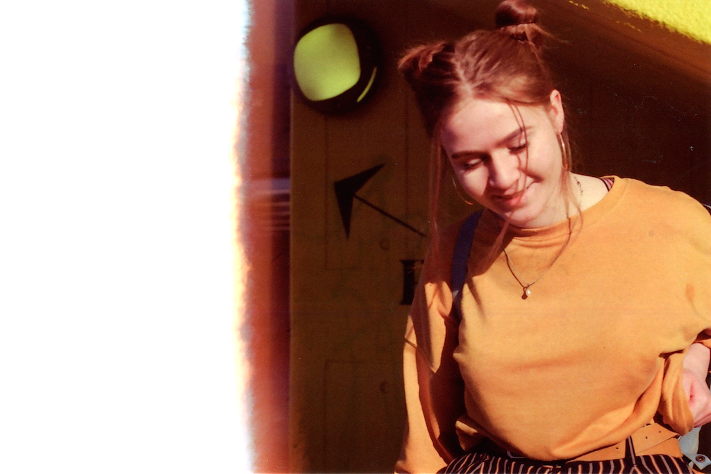
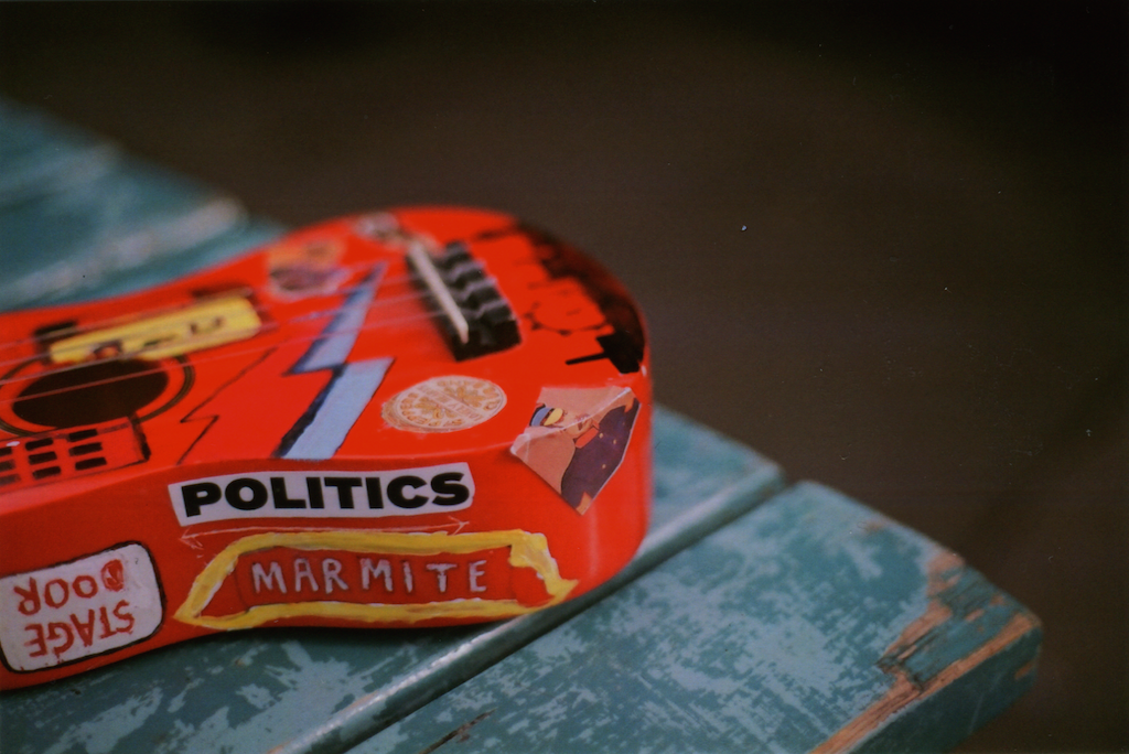
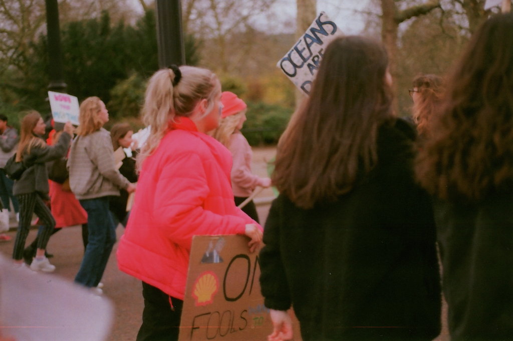
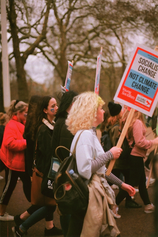
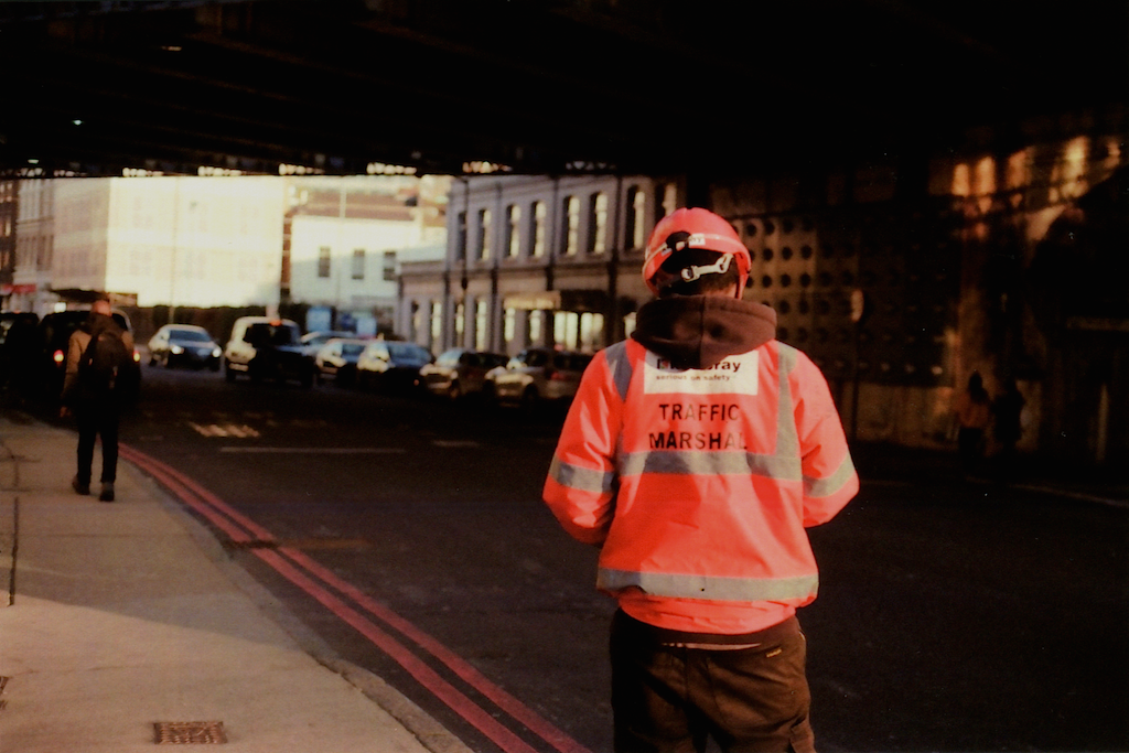
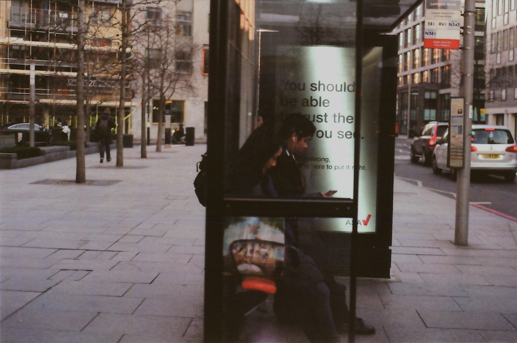
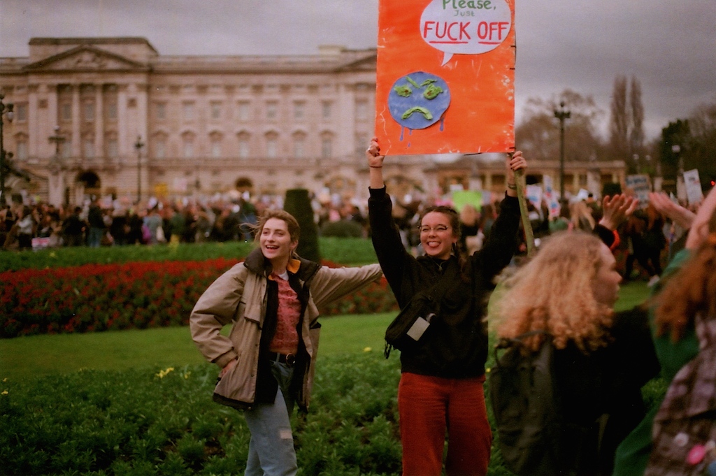
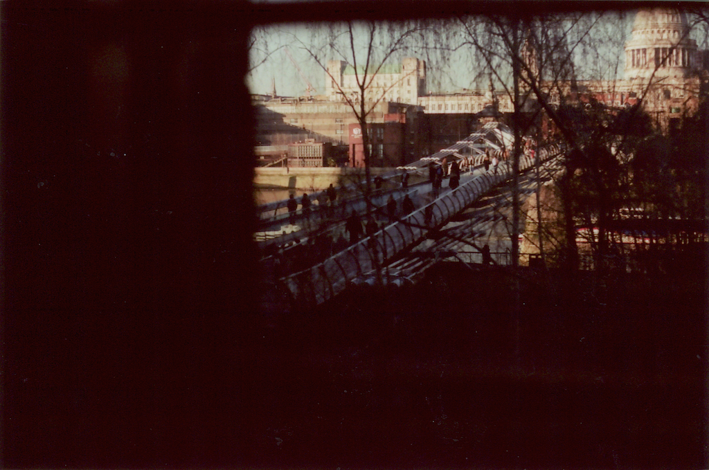
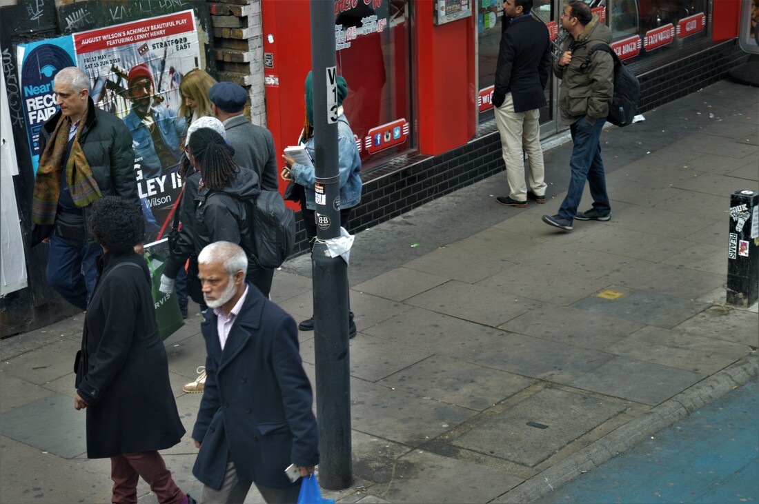
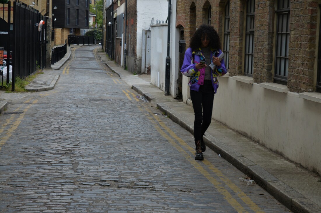
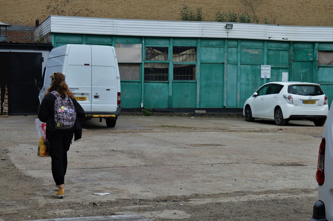
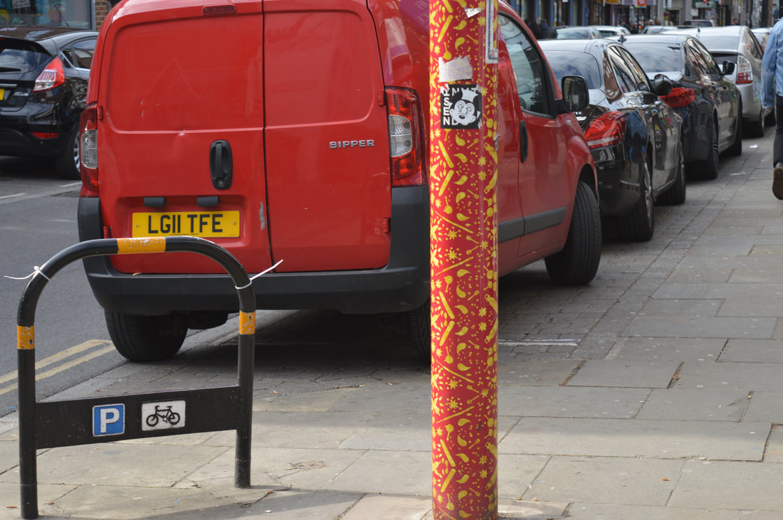
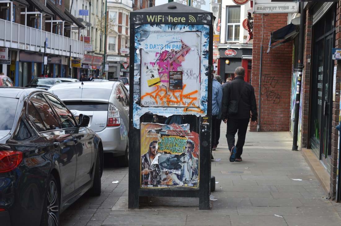
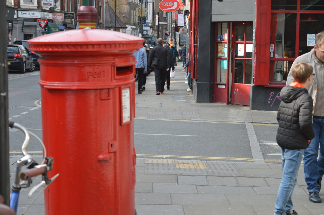
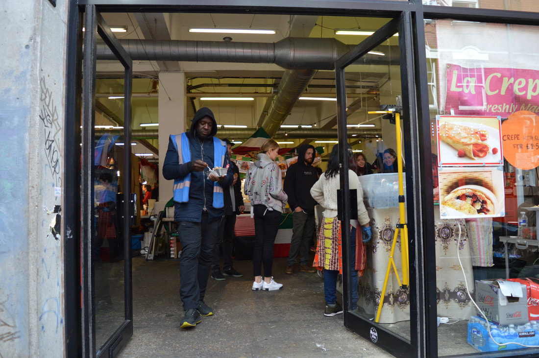
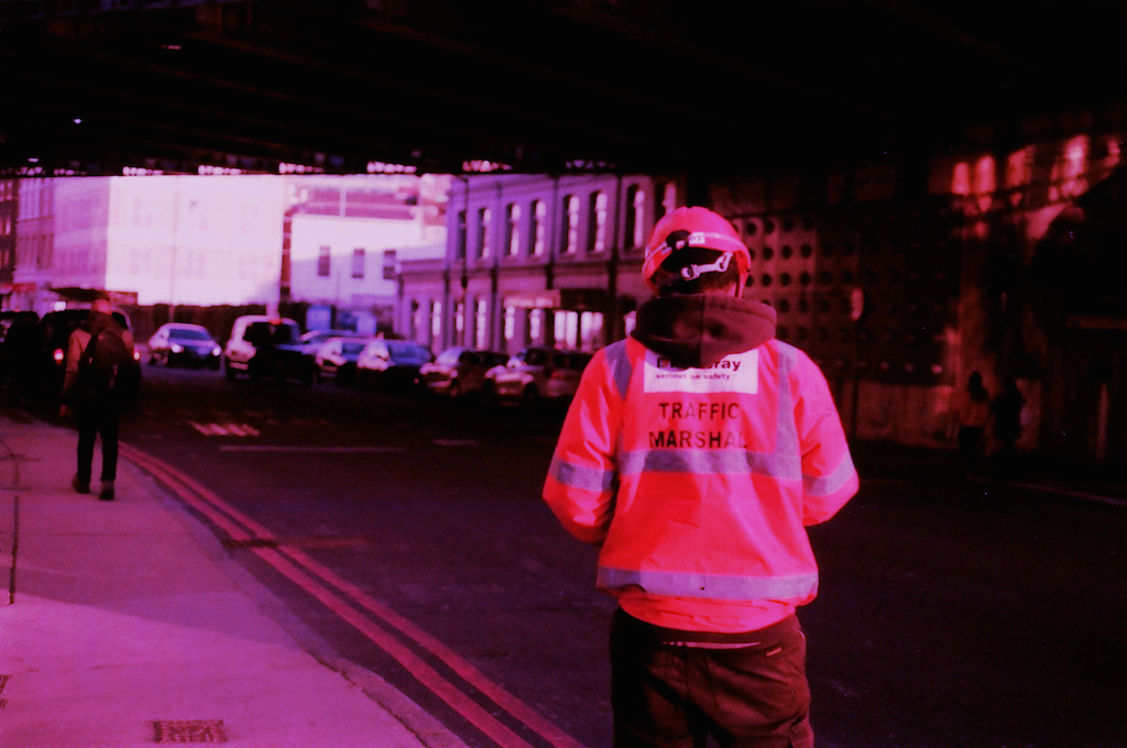
For my first photo shoot I experimented with film. I wanted to use film to make the photos more bright and colourful. I found that wit film the colours are deeper and more vibrant. I really like the tone that using a film camera give the images, but I also wanted to use other ways of photographing as film is expensive and I need to experiment with other methods. The photos are not a;ll from the same time, some are taken on a global warming march and some are taken when I was randomly out in central London with my friends. I enjoy taking photos as I come across something interesting without a plan because it makes the photo represent real life and I think sometimes photos can look too constructed. I had a setback when using film. The camera that I was using is old and slightly broken and it accidentally open when the film was still in it. Luckily it didn't ruin all of the picture and I was really lucky with one in particular as the light only bleached half of the photo and the half that was fine is the part of the photo that is the most important. This photo is actually on of my favourites as it reminds me of Saul Leiter's. In his photos there is often something obstructing the subject and I think the bleached paper kind of similar to this. Also the photo that I took of a bridge through a window is inspired by Leiter.
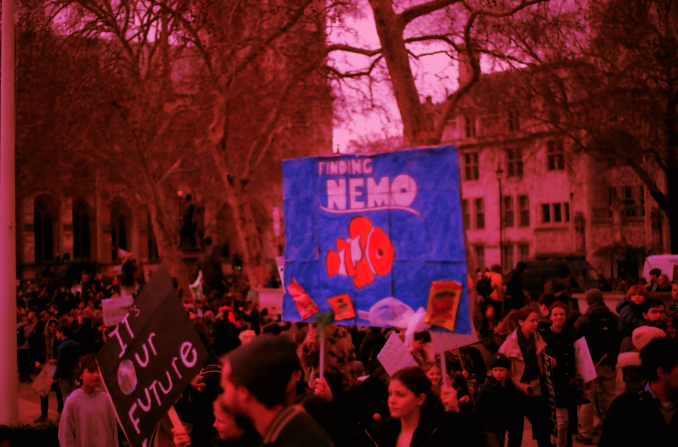
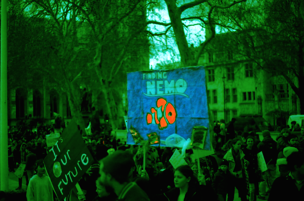
I developed this photoshoot by using some of the photos and taking them into photoshop and changing the colours. I think the one the worked the best is the first one. This is because by changing the colour of the photo, the mood is also changed. The red creates the feeling that it's an important issue and makes the photo bolder and changes the meaning of the photo from just a simple image of a poster to a serious issue that needs to be taken seriously. Like photographers use red in advertising to catch eyes and make more people notice the image, I also wanted to make it bolder. I prefer the red one to the green one as the green don't bring the same since of urgency to the photo as the red.
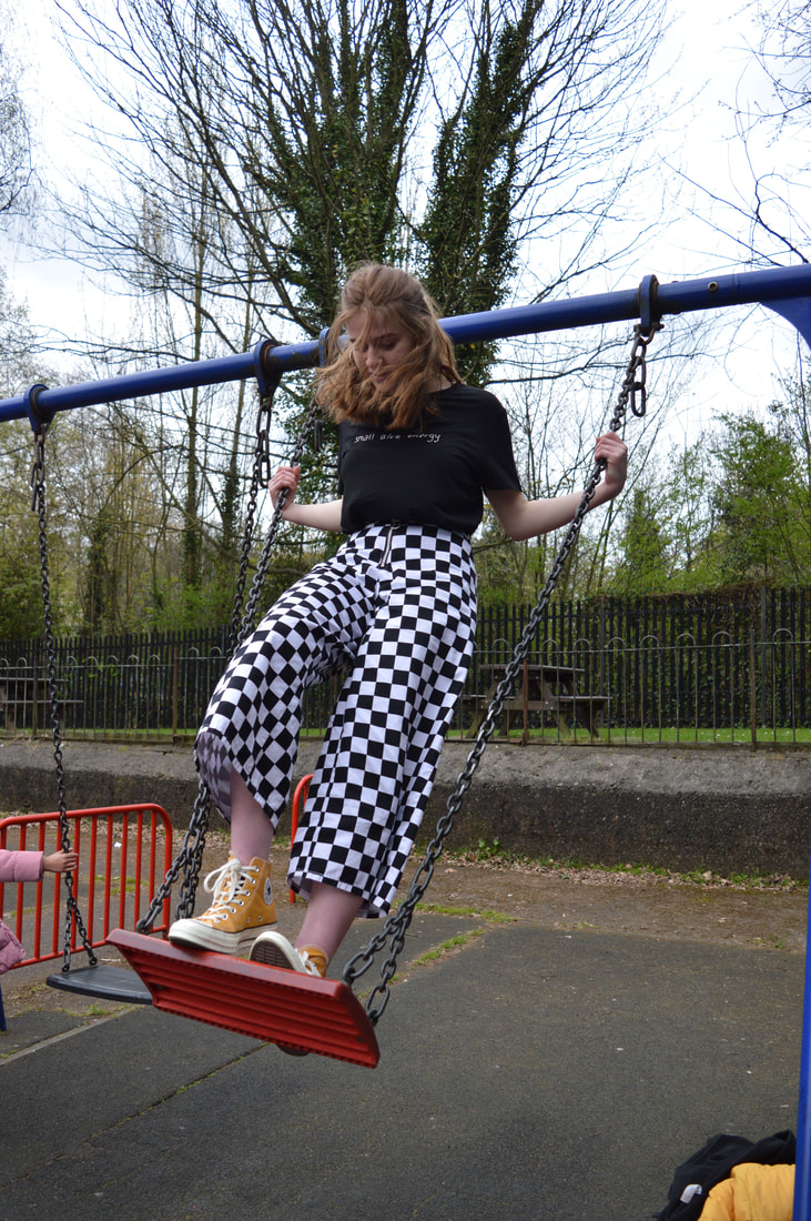
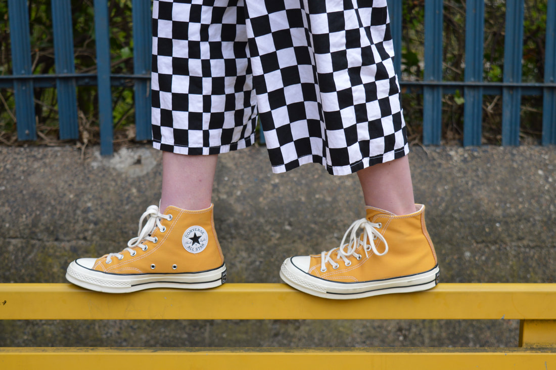
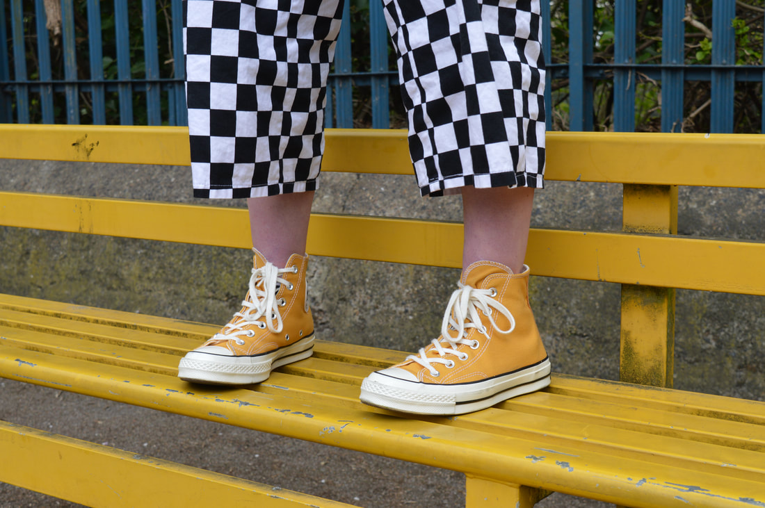
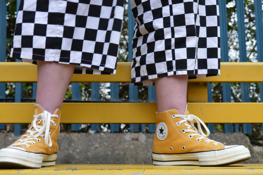
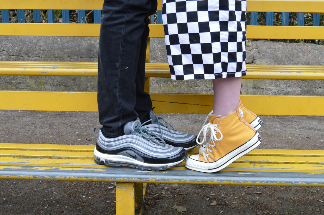
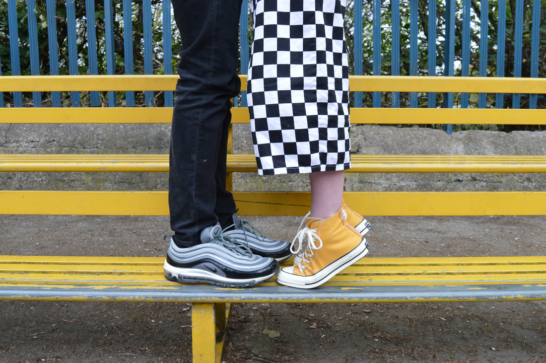
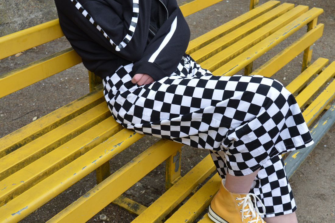
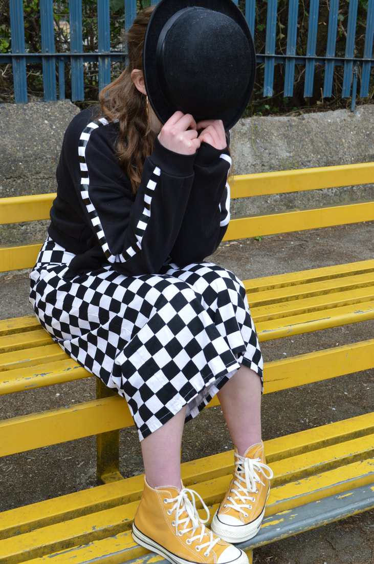
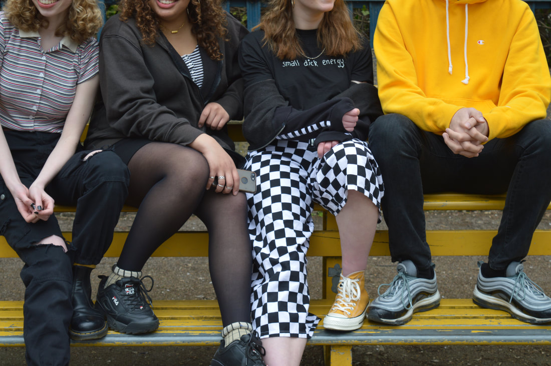
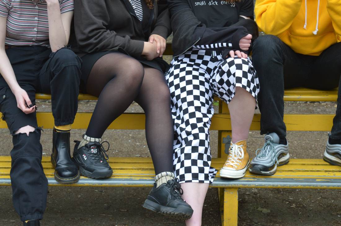
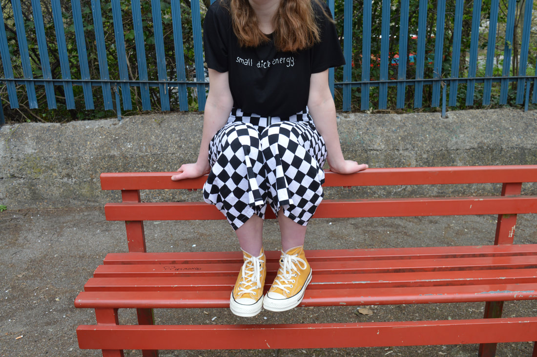
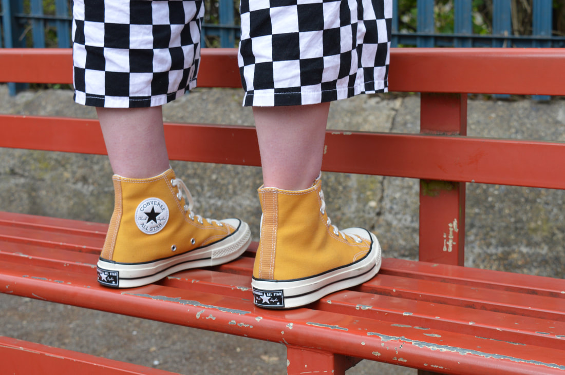
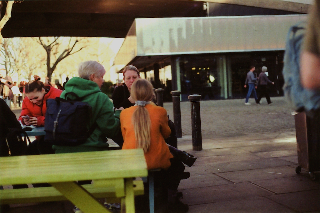
For my next photo shoot I decided to focus on one colour in particular. This time I used a digital camera instead of film. The advantage of using a digital camera is that you can take as many shots of the same thing as you want to make sure that you have the perfect picture and it's exactly how you wanted it. This definitely helped as now I have different versions of photos that I can choose the one I like the best. I tried using contrast in some of the later photos, but I preferred the ones where the bench was yellow too so that the main focus was just the one colour.