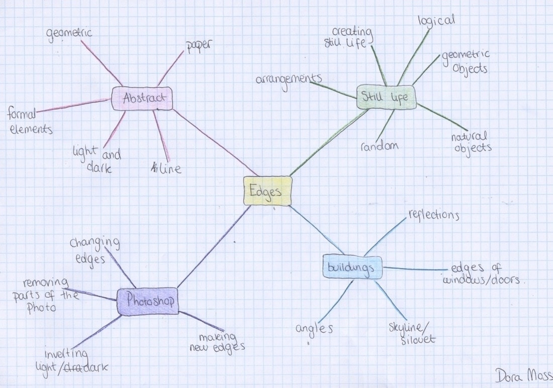
Introduction to Edges
Edges is our first topic that we looked at in this much depth. Before we had done things as a class and not spent more than a couple lessons on each project. So this was the first time we really got to do our thing . We looked at lots of different possibilities of how edges could link to photography and they way that photography gives everything new edges that aren't seen in the real world.
We did a lot of things around the theme of edges as shown below.
We did a lot of things around the theme of edges as shown below.
Before we started the topic edges in class we were given a homework to 'take photos of edges'. My approach was to take a photo of an object with only part of it in the frame and have a blurred background. I thought this was interesting because it emphasised the edge in the middle of the frame.


After the whole class was given an extension I changed my mind and wanted to do something a little bit different. So I changed the place to where I took the photos and so they would all fit together better I took them all in the school. These photos are where I started to go into the more structural and architecture type photos.


Using mirrors to explore edges in a new way in class:


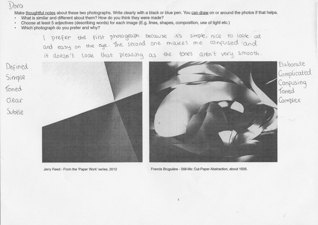
Evaluation:


|
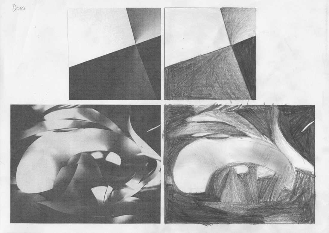
These were two of my favourites because I liked all the geometric type shapes that were made by the objects and the edges of the mirror and the way it linked to my other images and the architecture. Also, I really liked the contrast between light and dark.
|
I liked this one because it was kind of like an optical illusion and takes a while for you to figure out what is happening in the photo.
|
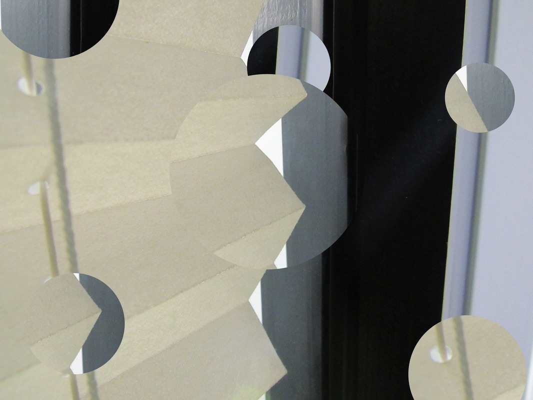
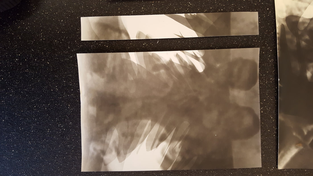
This is an abstract photoshoot of edges with a piece of paper and a light source. Sometimes it was hard to focus on the paper because either there was nothing to focus on or the paper was too close. We had to move around the light source to change where the light and the dark would be. In some the contrast is really small between the light and the dark and it isn't as abstract as the rest because it it more obvious that its paper.


This is the second shoot we did and this time I tried using a pink light. They turned out pretty cool but I didnt like them as much as the first shoot.


These are the best of the photos:


|
This is my favourite out of all of the photos I took. It's because i really like the contrast of the light and the dark and the composition just really works. |

|
I don't like this one for two reasons. One simply because its blurry and two because even if it was in focus the composition its very interesting. And the light and dark aren't very different. |
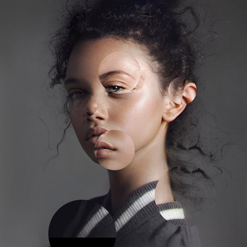
In class we used Photoshop to do some object clipping. This was my first ever time using Photoshop but I really like my final outcomes.
This was my first attempt at object clipping and I decided to just do simple circles and move the picture around to random places. I don't think that having used this photo to do object clipping was a good idea because it doesn't make the photo more interesting it sort of just distracts you from the photo. In a way this could be good and some people could like it but I think the picture wasn't right for this process.
This was my second try and this time I decided to move the picture in the circles just a bit and have the same facial features just shifted slightly.
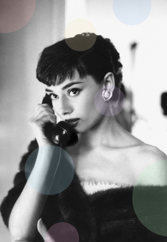
This was my last go at object clipping but this time I didnt want to move the photo around and all I did was add circles of colour to a black and white photo of Audrey Hepburn.
The process of object clipping:


Photo Evaluation
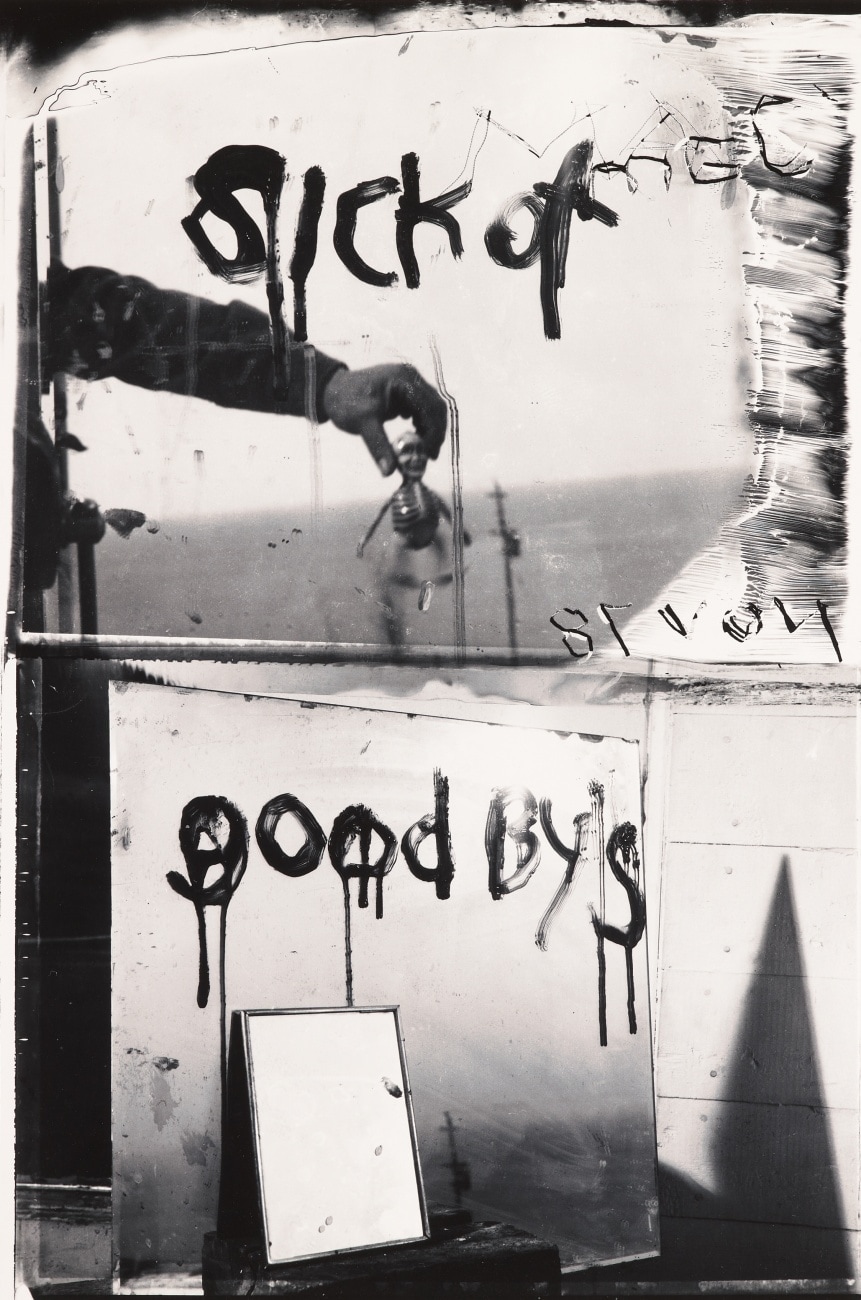
Robert Frank Sick of Goodbys
|
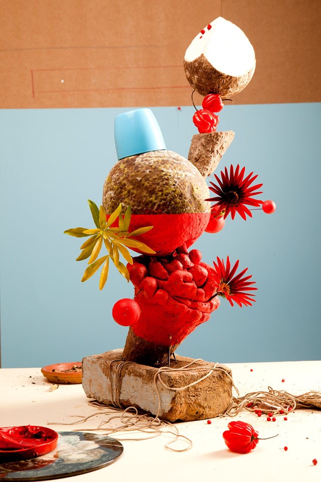
Lorenzo Vitturi Red#1
|
The similarities of the two photos are they are both messy, they have two contrasting colours and they are both put if the ordinary. Some differences are that the Robert frank one is black and white and the Lorenzo Vitturi one had bold colours. One has mirrors and an arm and the other is of flowers and slight more natural things.
Photograph one, the one by Robert Frank, is black and white made up mostly of different sized mirrors reflecting the horizon in front of it. On the mirrors there is writing in spray paint that says ;sick of goodbys'. Also, a reflection in one of the mirrors if someone's arm holding a tiny model skeleton.
The second photography by Lorenzo Vitturi has bold and contrasting colours like blue, red and orange. The background is split between three colours, orange, blue and a kind of peach colour. In the middle of the photograph is a tower made of bricks and flowers and something that looks like a coconut, The tower is made of really random object that are unrealistically balanced on top of each other.
If I had the chance to ask to ask the artists some questions I would Frank why he chose to make the photo black and white and why he chose to spell 'sick of goodbys' like he did. Some questions i have fro Vitturi are why he chose the objects in the tower and as the name of the photo is Red#1 are there more photos that make a series.
The edges I can see in the photo by Frank are the outer edges of the mirrors, the shadow created by the mirrors and the illusion of the arm being flat because the picture makes it 2D. In Red #1 by Vitturi the background is split into three colours creating an edge where they meet. All of the objects that are used to create the tower are varied in size and shape and make a lot of interesting edges in a photograph. In Frank's photo all the edges are mainly squares and straight lines where as in Vitturi's there are a lot of small and more defined edges.
If I was to give Robert Frank's photo a different name it would be 'goody to sickness'. I chose this because, the photograph is all about reflection, so iI thought it would be interesting to switch around what the words say as if it was being reflected but make is so it still makes sense. I kept the misspelt 'goodby' because it might be important to the photograph and so it would be better if I kept it. If I was inside Vitturi's photograph I would be very small compared to the tower and it would seem like it could topple over and crush me at any time. The colours would make me feel sick and uneasy because they are overwhelming and bright.
Jelle Martens
Jelle Martens is a Belgian artist and graphic designer. He is best known for his photography and collages. He seems to work mostly around geometric shapes such as triangles. I like his work he did that relates to edges because its simple but looks very interesting when its finished. Playing around with he edges in a photograph is a really fun way to make a simple photo a lot more interesting. I like the way he added in blocks of colour to some of ten just to rearrange how the image was layer out. I really like the way he did this so I might do something similar with a few of my photos. These are some of the collages that he made that go along with the topic edges.


Fanzine |
In this image Jelle Martens got a couple of photos of some motor bikes and he photoshopped them and cut them up into different shapes and put them over the top of a blue background to make a whole new photo. There are a lot of lines and corners that make the design more details and more interesting to look at. The part that stands out the most is in the top right corner where the original photo is orange and the rest of the photo is all pink and white. If I could ask him one questionI would ask him why he chose those specific photos and what is the significance of the motor bikes.
|

|
|
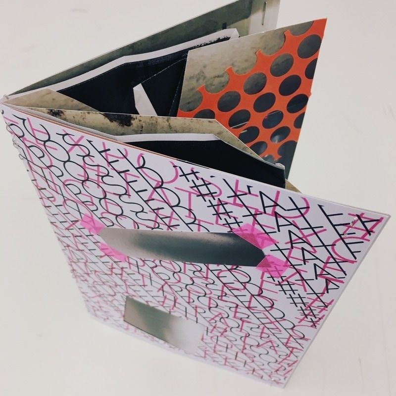
In class we made fanzines. We were given a range of interesting photographs and some other accessories and given about 20 minuets to try and create the most interesting fanzine we could think of. For mine I chose a black, pink and white cover and used only black and grey photos. I also used orange and yellow stickers to make some more things to look at.
www: I think I made a quite interesting fanzine given the time we had and I think that is eye pleasing and makes you look closely at the photos as they are all black and white so they are quite similar at first glance.
ebi: Maybe next time I should experiment with more colours to make it more eye catching and paid more attention to the little details.


My Final Edges Outcome
For the whole term I was really interested in man made structures but I was getting bored of the same types of photos so I thought of hands and they originally made all of these structures but now there are machines that do it for us. I also really like photograms so I linked my two ides for my final outcome together and made these images.


I cut them in different ways inspired by a no entry sign to signify the change between the time where people made things with their hands and then when people made machines to do that for them.
This is my final outcome. I arranged it on a long piece of mount board from light to dark an the difference between the contrasts. Coincidently, in this way it also starts small, gets bigger and gets smaller again. The sequence of photographs tells a story of time and construction, in the middle in the background of the photo you can see two people and that is sort of like people in the story of time and evolution. Its gets darker towards the end and that could link to how the world is being destroyed by individual people but also how everyone is destroying the environment.
www:
Its well constructed and didn't take a really long time to make. It looks really put together and definately looks like a final piece. It's not detailed and confusing so it'ts easy on the eye and is nice to look at.
Its well constructed and didn't take a really long time to make. It looks really put together and definately looks like a final piece. It's not detailed and confusing so it'ts easy on the eye and is nice to look at.
ebi:
I could have made the original photograms a bit more interesting by adding more negatives to the background that suited my idea like I did with some of them.
I could have made the original photograms a bit more interesting by adding more negatives to the background that suited my idea like I did with some of them.

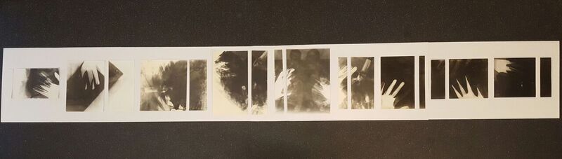
This is a mini final outcome that I made a while before making my actual one above. The photos I used were two from the paper abstraction shoot we did. We were all told that we had to have two or more photos and put them together in anyway we wanted, so I cut them up into strips of about 1 inch and a half and put them on a mount board in layers of squares tilted to the side. I think how I did it was really interesting because by cutting up the images I created a lot more edges of the photos than they originally had and also it's quite weird the way that because the strips are all separate it's impossible to imagine what the composition of the original photographs are.
My Edges Exhibition
I decided to do my exhibition in my stairs at home. I chose this as I wanted to make a place that you don't even think about more interesting. I like the way the stairs look old and bare because it makes you realise that photos don't have to be displayed in a big, empty, perfect room in an expensive buildings. Also, the stairs themselves link back to the topic of edges as well and go along with my theme of man made things. On the walls are some whole photos and some that I cut up and made more interesting shapes for all the different images. On the stairs are some other photos that are there simply because it's just somewhere you wouldn't think would be a place for an exhibition.


These are all the photos that I chose to display in my exhibition.


