The Human Condition
The human condition are characteristics and events that make up the existence of a human. This includes things like human nature, emotion, ambition, birth and growth. I chose this topic because I am interested in capturing emotion and life in it's purest form. I am also interested in companionship and relationships. I am going to experiment with all different types of companionship including relationships between humans and objects.
Duane Michals


Duane Michals didn't go to school anywhere to learn about photography, he just picked up the process and makes very interesting and unique photos.I have selected my favourite photos from Michals' portraiture portfolio that relate to the human condition and relationships. All six have different types of companionship in the photo, some having multiple people in the photo interacting with each other and one in particular where there is just one girl in the photo using an object to obscure her face like a prop. The photos that he takes seem very intimate and personal to him creating a unique story behind the photos.
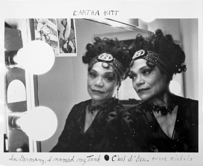
This is my favourite photo by Duane Michals. My first thoughts about this photo was that the reflection represented the woman's mind or soul. It's like she is separated from her soul but still connected through the mirror. I like that she is leaning on the mirror, so that it isn't just a woman and her reflection. It makes it more connected to the idea of the human condition and relationships. Her expression also interests me, she has a sort of smile but her eyes look sad. Also the way that her head is positioned makes her look more sad as well. Duane Michals makes all of his photos black and white, I think this is a good way to neutralize the photo so you can ficus in the feelings instead of the colour. It also doesn't distract you from the subject of the photo.
My Response to Duane Michals


William Eggleston


In contrast to Duane Michals, William Eggleston makes vibrant photos. He uses the colour to help express what is happening in the photo. His use of colour was unordinary when he first started taking photos as people who were taking photos in the 60s weren't focusing to much on colours. I am interested in the way that he captures part of ordinary life making it look so happy and vibrant. Most of the time the colours in the photo are contrasting with something else in the photo. For example, the photo in the top right has a colourful wall in the background and in the foreground is a woman looking quite angry. I like this photo because the colours are bright and uplifting but the woman makes the mood of the image completely different.
My Response to William Egglseston


My response to William Egglseton's work was mostly based on colour. I tried to make the photos have really deep colours and to be in the sun so that they looked even more vibrant. I asked my friend to wear a yellow jumper because I wanted it to really stand out and in the world yellow isn't used a lot so I thought that it would easily contrast with everything. I tried to mostly take candids so it represented real life as much as possible but it was a lot harder than I thought it would be because my friends either laughed when I tried to take a photo of them or just felt really awkward. Sometimes I managed to get a photo of them without them noticing and these turned out really well and are exactly what I was aiming for.


I tried to improve my first photo shoot by taking less posed pictures and more of just my friends doing what they usually do and me just around them talking lots of photos. When it got darker, I turned on the flash and reduced the shutter speed to get some interesting sort of smudged looking photos. I think these are really cool because they are sort of fluorescent and I really like they way that the smudges look like lights. When you don't pose for a photo and you just try and take a quick picture of someone, then it's easier to make mistakes. For example, there is a few photos that I really like but the automatic focus on my camera focused on the wrong thing and I didn't realise until looking back at the photos, and I usually only got one photo of that specific thing because they didn't stay doing the same thing for very long.
'Notes from Jo'

'Notes from Jo' Keith Arnatt 1991-95
The photograph is of a post it note on a wall or fridge or just any flat surface. The posit note is a reminder for someone, from Jo. Most of the writing is in black but there is one part that is bigger and in red. Also in the red part the command word is underlined as if it is the most important part of the note. Red might also mean that is is filled with anger or maybe just urgency. The note starts off with a polite introduction and information about the kitchen but it is interupeted by the direct and an direct command. Maybe the person. that Jo is writing the note for doesn't usually do what they are asked to do, hence the big red command of 'YOU WILL DO THIS'. Keith Arnatt chose to take a photograph of the note but also a bit of what the note is stuck on. The background is just plain white and there isn't a way of knowing for sure what it is. I think that this was done on purpose to make people wonder about the relevance of the note, like where it is and why it's there. There are so many questions that the photographer has left for everyone such as who it's addressed to and why they have left the note and what the relationship between Jo and the person the note is for. I think that the photo was left plain and ambiguous that there was lots of room for speculation and so that each viewer had a completely different interpretation off the mean behind the photograph. There is also a contrast between the note and the background making the not stand out. What is strange about this photograph is that usually when a photo is taken it changes something from 3D to 2D, however with this photo the posit note was already 2D. The photo doesn't have an obvious point to it and I think it is intriguing that he chose to tell a story about Jo through what she writes to other people on posit notes. Usually when you write a note to someone on paper or a posit note then it gets seen by the person it is for and then it most likely gets thrown away but the series of notes that Arnatt has chosen to take photos of will last forever.
I think the photo is very interesting but I don't particularly like it by it's self and it doesn't fit in with the aspect of the human condition that I am looking into. It makes me think of everyday life and normal things that humans do. I am interested by the idea but I prefer photos with people in them rather than just words. In my opinion it would make the photo a lot better if there was a picture layered either on top or beneath it. It could fit in more with what I doing if if had some sort of background that could tell the viewer more about Jo or the other person.
Photography Exhibition
|
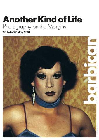
I researched many exhibitions around London trying to find one that was related to my topic 'The Human Condition' and I found Another Kind of Life that was on at the Barbican.
The exhibition featured 20 photographers from the 1950s to the present day and was about people's lives and communities and followed the lives of people who didn't really 'fit in' to society's 'norms'. Some of the photographers that I liked from the exhibition were Dayanita Singh, Philippe Chancel, Paz Errázuriz and Casa Susanna. For the most part I enjoyed the exhibition, however I was slightly disappointed because I felt like there were too many photographers which meant that there weren't very many photos from each photographer so in a way there was too much to take in and you. Each photographer had a separate room and sometimes the room was very small so there really wasn't many photos in there which I thought was unfair. I think that it would have been lots better if they had chosen less photographers more around 10 and given the viewers a deeper look into their work. |
|


Cindy Sherman


Cindy Sherman created the sets of fake films and shot the film stills with really overacted facial expressions and actions. These photographs are my favourite from her collection of Untitled film stills. The series of photographs depicts the representation of females in old fashioned films. None of them are titled and none of them are linked. Some of the photos she posed in herself and others she asked her friends to help her and be the female in the photo. I like the way that each photo is it's own and they are all so different. She shows in the photographs what women in films were like and what they were expected to be in real life. This concept really interests me with all the labels, expectation and stereotypes. I like the idea that the models are putting on a mask and acting out different roles and different kind of women.

|
I like this image in particular. It's of a lady in a room that seems to be a dinning room or something. In the foreground is a table or a counter of some sort, then in the middle ground is the lady and in the background is a dresser and a mirror. She is standing in the middle of the frame and looking off to the side making me assume that if it was an actual film someone just walked in the room. I like the way that she really thought about how to make it look like a real still from a film. She really thought about all the little details, there is a photo on the dresser that is of the same lady in the photo, making it even more real. There is also big contrast between the girl's black dress and the white wall making the girl stand out a lot. She is the first thing you look at when you see the photo and then your gaze goes to her reflection in the mirror behind her. I like the touch of her back in the mirror. It adds to the whole idea of the series of photos and the image of a woman, seeing the back and front of her dress shows that what women wore was important and they were expected to always look nice.
|
Over the summer, I started my experimenting with emotion of by simple portraits of people. For each photo I told them a different emotion I wanted them to act out. The main focus was their expression so I decided to take the photos with a plain white wall behind them in natural light. My original idea was to have a series of photographs of different people doing the same emotions as each other, showing the differences in people's minds. However, it was very difficult to do this because I found out that some of the emotions were harder to do for some people.
After considering what could make the photos better I decided that I wanted to try to take some with other thing happening behind the person. Also, instead of giving up an not dong the same emotions for every person, I would like to show how some people can't show certain emotions as well as others.
After considering what could make the photos better I decided that I wanted to try to take some with other thing happening behind the person. Also, instead of giving up an not dong the same emotions for every person, I would like to show how some people can't show certain emotions as well as others.


Diptychs and Triptychs


I made three diptychs with my photos of facial expressions. I decided to mix together two different people for all three. I am really happy with how they all turned out and I am excited to carry on experimenting with this process.
For the first one I went into photoshop and choose two photos that I wanted to put together that had similar emotions in. I cropped the side of both of their faces and placed them together with a space in-between. I chose to cut out the actual expression to contrast with the original photos and ideas.
For the second one again I used photoshop, but this time I chose two contrasting expressions and put the two halves of the photos together to make a sort of whole face.
For the last one I tried more of a traditional diptych. The photos have an obvious relationship as they are both of people laughing. Also the photo on the right she is looking down and in the photo on the left she is looking up and this goes with the idea of contrasting in all of the other ones I made.


"We are making photographs to understand what our lives mean to us"
Ralph Hattersley
This is a quote by Ralph Harrersley, who wrote lot's of books about photography. I chose this quote because I thought that it is a general summery of what the human condition is all about. I think that the human condition is about what it means to be human and also what makes us human. All my experiments so far have been about investigating what makes us the way we are. I have been looking in to what humans do in normal everyday life and most recently, I have been photographing emotions. I will experiment further into what forms a human life.
Marianne Olaleye


My Response to Marianne Olaleye


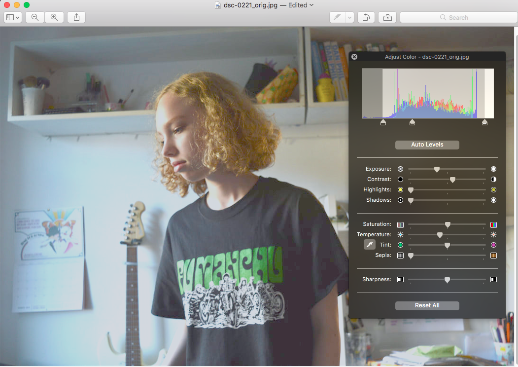
For my response to Marianne Olaleye I went to Central London, specifically to a place with a bunch of food stalls. I thought that I would base many of them on street food, first because Olaleye had done a photo of a guy making something and also because I thought that street food and markets are part of human life that has been around for a long time. I am very pleased with how the photos turned out and I edited some of the photos to look similar to Marianne Olaleye's. In some of the photos I made them black and white and some I lowered the saturation and the one that had the brightest colours I increased the saturation.
Bert Hardy
 The Rural Dean of Stepney with some of his flock - 1940 Bert Hardy
In the photo there is a Reverend turning and smiling at the children chasing him. The photo was taken in Stepney during the Blitz and depicts a bomb-damaged street. The Reverend French is the Rural Dean of Stepney known as "The East End Parson". He was admired and loved by the people because he worked hard to help those who were severely affected by the bombings. The kids really did run after him in the streets just as the picture shows, however Bert set up this photo to ensure he captured what he wanted. I think this picture was probably taken with his Rolleiflex using a 50mm lens.
The focus of the image is the children running after the Reverend, the image has been framed so that the subjects are exactly in the middle. The houses in the background are shadowy and dark with a sullen, sad feel. The background is empty and dull with no activity so the viewer's focus is on the subjects. The pavement appears illuminated pulling the viewer's eye to the Reverend and children. What I am most interested by is the conflicting ideas of the devastation caused by a bomb and the joy the Reverend brings. The skipping children and smiling faces create a sense of happiness and well being. This is emphasised by the use of light on the pavement making the photo brighter and less concentrated on the destruction of war. In "Bert Hardy's Britain" by Colin Wilkinson the photograph is printed much brighter and interestingly changes the whole sense of the photo. The version in this book seems bland and without as much emotion when compared to the version in Bert Hardy's own book "My Life".
This photo is from Bert Hardy's early days at the Picture Post. He was in Stepney to record the East Enders' reactions to the bombs that rained down on London.
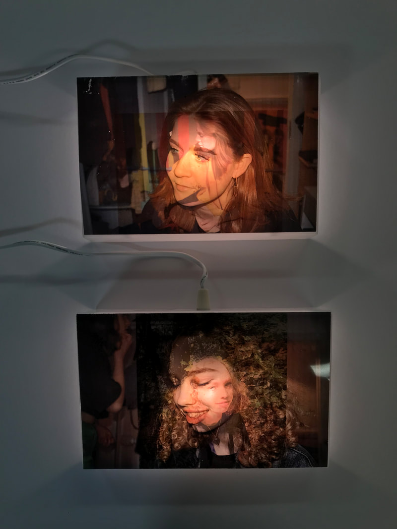
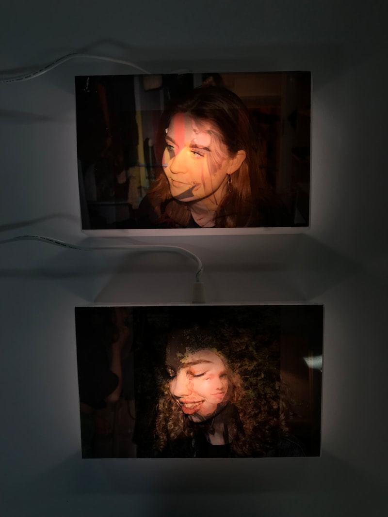
Final Project: The Idea of Growth
Growth can be intertwined with many aspects of the human condition and with my idea I am bringing together multiple things that I have been experimenting with. My idea is to show time and change through photos. I want to print a photo onto acetate and after a long time retake the photo through the original to show growth. The end result will show how how the world changes over time. Ideally for this project I would have a much longer time. In my mind the second photo would be taken years later to really showcase the growth of the people. However, I have a short time to finish this so I am going to just show how my idea would play out with photos that are a couple of months apart or just a few weeks.
|
The photos that I chose to print on acetate are from all different little projects as I wanted to include a lot of different aspects of the human condition and bring them together with one project at the end. Before printing them on acetate I brightened them so that they would be more see through on the acetate. I used the adjust colour tool to increase the exposure and changed the levels so that the photos were whitened. The reason I did this was the new photos when printed on the acetate the pale parts of them are completely see through. |


After printing and experimenting with taking photos through the acetate I changed how I wanted present them. Photographing through the acetate didn't work out like I had imagined as either the background was in focus or the original photo. So I decided to take a photo of the girls now and layer them together. I experimented with different ways of layering the photos together:


Final Piece
|
|
For my final piece I decided to present the layered photos on light boxes. They are about A5 and this is because the piece is based around memories and change and they are small so that they resemble photo albums and scrapbooks. The light is in the middle of the box and perfectly highlights their faces really well. The light in the middle also darkens the outside and this gives a sort of vintage look emphasising the idea of change over time. I am very happy with the way these turned out and to further my idea I would present them in a gallery either hanging on the wall like picture frames or just sitting on a table like a book would be.
